Decor, Home

How to Create a Tides Beach Club Room at Home

Last week, Pablo and I visited Maine for a belated anniversary vacation. We stayed at the beautiful Tides Beach Club in Kennebunkport and yesterday, I showed you lots of pics from the rest of the hotel. (I’m still dreaming of those lucite stools!) The hotel was gorg from top to bottom and we couldn’t have been more pleased with our cozy and charming room. Sure, the view was to-die-for…

…but the room itself was beautiful too. Following each picture are my ideas for getting a Tides-style room at home.

For coral basketweave textured wallpaper try here or if you prefer paint (I do!) try Benjamin Moore Picante.

The headboard with nailhead trim made such a big impact in the room. Try this beauty from here.

Teal looks great with coral. This similar wall art can be found here.

The bed was a perfect interpretation of “modern beach”.

I’m sure you know where to get crisp white sheets and duvet but I always get mine from here.

For a little pop of color, add a coral and white duvet cover folded at the end of the bed like this one.

A decorative shell pillow from here would work or for a more authentic embroidered look, make your own with this.

We loved the glossy wainscoting on the ceiling – and this star shaped light was a surprising touch.

You can find a flushmount like that here.

The room was tiny but there was just enough space for a pretty chair in the corner.

You could get the look with a white slipcovered chair from here.

Similar decorative chair pillow from here (but please don’t karate chop it like this one!)

Heavy draperies look great hanging from thick curtain rods. Curtains made in this fabric from here would be pretty similar.

For a totally coordinated look, have your man wear a matching coral shirt. It really completes the color scheme! (Sorry, I don’t have a resource for him. He’s not for sale.)

For info on booking your own room at Tides Beach Club, click here.

XO

Sue at Home

Decor, Home

Decor Ideas from Tides Beach Club in Maine

Last week Pablo and I took a quick trip to Maine for a belated 10-year anniversary celebration. We stayed at the beautiful Tides Beach Club on Goose Rocks Beach in Kennebunkport. The inn recently underwent a huge renovation, turning it into a charmingly modern interpretation of “beach chic” that still stays very close to its laid-back Maine roots.

The beautiful porch out front was always full of people (sipping coffee in the morning and cocktails in the afternoon) so I could never get a shot of it empty. Here’s a great picture from the Tides website. The chairs were so big and deep that I had to pull my feet up into them. I could barely reach the ground!

We never learned to play backgammon but that didn’t stop me from falling in love with this navy lacquered game table and white slipcovered chairs.

A bookshelf offered beautiful coffee table books to peruse while you sit under a  rope wrapped chandelier. And how about those chairs? They’re like luxe cushioned director’s chairs. Love!

I fell in love with a pair of these oyster lamps and almost considered grabbing a similar one when I spotted it in Antiques on Nine, a Kennebunk shop. But then I saw the $795 price tag. No thank you.

I was absolutely smitten with these thick crystal lamps. Clearly, good lighting makes me weak in the knees! I also loved the weathered chest though I wish there wasn’t another one just like it nearby. (The repetition made the weathering look obviously fake. Know what I mean?)

There was classic wainscoting everywhere – on the ceilings, up the stairs….

The restaurant side of the main floor was sleek and modern but still totally beachy. (And yes, I’ll be giving you a closer look at those lucite stools in just a moment. Please try and be patient!)

I can’t believe it took me 2 days to notice my beloved Hicks Pendants hanging in the porch section of the restaurant. (We have the bronze/antique brass version in our kitchen. I think theirs were the polished nickel. And MUCH bigger than our little one!) They’re gorgeous in any size or color!

I wonder if this doorway detail was original or if it was found in an architectural salvage place. Either way, it was a beaut!

I kept rubbing my hands over the divine carrera marble bar top but the bartender told me it’s a bitch to keep neat. It’s so porous that every drink ring remains and don’t even think about getting any citrus near it! He showed me a bleached out spot that a lemon wedge left behind. They had to have it completely sanded and refinished within a year of getting it. I’m still in love with carrera marble (have been ever since we got these tiles in our bathroom) but I think I can give up my dream of having it as a kitchen counter. High maintenance and I are not  friends!

Even the drinks are pretty at Tides. I can assure you that my Blueberry Fizz was as delicious as it looks!

Let’s take a moment to talk about those  gorgeous lucite stools! I seriously would have tried to slip one into my clutch if they weren’t so heavy. (Only a woman drinking too many Blueberry Fizz’s would think she could sneak out with a stool!) But seriously they were absolutely beautiful and the visual break allowed for you to see all the way to the tufted bar. It was all truly a work of art.

Speaking of art, check out the photos from a Kennebunkport photographer that were hanging in the restaurant. It’s dogs hanging out of car windows! Aren’t they so sweet? The photographer is Christopher Becker and the collection is perfectly titled Canine Bliss.

While the doggies hung in the restaurant, the hallways of the hotel with filled with matching frames hung in a perfectly haphazard “pattern”. What was in the frames you ask? Random stuff. Personal family pics (whose family? I don’t know!), interesting modern art prints, fashion magazine pages (bedazzled with glitter glue!), and even some vintage images. I love the way it looked (it kinda reminded me of John and Sherry’s hallway) and it inspired me to finally hang something in our lackluster hall. Hopefully, I’ll be getting on that project soon!

I hope you enjoyed the tour of Tides Beach Club. Tomorrow, you get to see our charming, cozy (ie: small) room complete with resources to create a Tides-style room of your own. See you then!

Did you take any fun summer vacations? Do tell!

XO

Sue at Home

Before and After, Decor, Home, My house

Jewelry Storage: A Work in Progress

In our old house, we had an enormous master bathroom where I had enough room for a dresser whose sole purpose was to store my jewelry. Let your head absorb that for a moment. An entire dresser for jewelry! Now, in my small master, there’s barely a dresser top and one drawer for my baubles. Which means that most of them live in bags in the closet. It’s sad, really.

So, my jewelry storage isn’t perfect but it’s working for me…for now. Check it:

The neon orange acrylic tray was a Home Goods find. It’s lived all over the house but I like it best for my jewelry. I keep most of the everyday options in here – some long chain necklaces, wrap bracelets, and some bangles –  big and small.

I store my cocktails rings and my dangley earrings in this  little square silver bowl. (I can’t for the life of me remember where I got it. I certainly don’t love it but it does the job so for now, so it stays!)

My wedding band, engagement ring and watch live in an ashtray when I’m not wearing them. I got it in Paris and – full disclosure –  I can’t imagine how it ended up in my handbag. (I’ll blame the caviar and vodka.)

Some of the bigger statement pieces – necklaces and bracelets –  live in the top drawer of the dresser.

The “drawer liner” is actually wrapping paper that I got years ago at…you’re never going to believe this…Old Navy. Crazy, right? I love it and I might frame a piece of it to display in front of the poster in the room.


If you’re willing to dedicate a little more space to jewelry storage, here are some good ideas:

Monaluna‘s frame with hooks

Jewelry as wall art at BH&G

Catherine of Hallelu on the Glitter Guide

Cabinet and bowls via Martha Stewart


The great embroidery hoop trick via Apartment Therapy

Sherry’s baubles in an egg crate via Young House Love

I have way too many pieces to do any of these options (remember, you’re only seeing a fraction of my collection in the pics above) but as the mom of two girls, I know I’ll regret parting with any of it. Think of all the future “dress-up” parties we’ll need things for, right??

Tell me…how do you store your jewelry?  Or better yet…how do you pair it down?  For now, I’ll horde mine in the little bit of space I have…

XO

Sue at Home

Decor, Home, My house

The Hunt for Master Bedroom Bedding

Last week, when I told you about the room that inspired our master bedroom palette, I touched upon the decadent, sumptuous, to-die-for bedding from Olatz Schnabel that graced her bed in our inspiration picture. I would have loved a full set of her bedding but I don’t have a spare $4000 sitting around so it’s not going to happen. But, that’s no reason not to dream a little and try to find a similar solution.  Here are a few shots of Olatz‘ bedding line. Let the drooling begin.

Olatz Schnabel (the person) draping her gorgeous self across her gorgeous bedding (from Olatz, the bedding line) on her gorgeous bed via Pursuit of Style (It’s just wrong to look that good.)

A clear shot of the full set via Olatz. The sham is only $300. Maybe I could just get one??

The pink and red version  in ELLE Decor with…wait. What is that? Yes. Yes, that is a MATCHING HEADBOARD. Just kill me now.

This famous cover is like a trifecta of style obsessions: Domino + Jenna Lyons + her Olatz bedding = my head about to explode! Throw in black painted walls and that fireplace and I’m dead. Dead. via Habitually Chic

The Bowery Hotel apparently has Olatz bedding in every room. May I move in, please? (This pic via NY Mag)

When GQ (my first job was the Fashion Closet Assistant there!) did a story on the best bedding, of course they needed to include Olatz bedding. Insert cute girl in bra and panties to GQ-ify it.

Little Green Notebook did a makeover on Joanna Goddard‘s bedroom and she had an Olatz-ish duvet made for the room. Perhaps this is an option for me? (Still can’t be cheap though…)

CarolynMAKING has a great no-sew (!!) DIY of the Olatz bedding. She did an amazing job but I feel like I could screw up something  even this simple.

The crazy thing is that I look at these pics and think, “Everyone makes duvets like this. I’ve GOT to be able to find something similar.” But the problem is the colors. You just can’t find that bright orangey red or that regal purple at mass brands. Pottery Barn makes a nice duvet and sham with a band of color. But in classic “Pottery Barn style”, the color choices are basically beige, beige and more beige.

I found our current duvet at Lands’ End about 9 months ago. They don’t have it anymore but I highly recommend their bedding. It’s super soft, really nice quality and priced very reasonably.

It’s frustrating to know there’s got to be something similar out there and just not be able to find it.  (Please let me know if you have a resource for me!) I might just have to try the DIY. If I do, you know you’ll hear all about it! Until then, I’ll live with my subtle stripes because let’s face it, that old way-too-small headboard is a much bigger problem than the duvet! More on that later….

XO

Sue at Home

Decor, Home, My house

I Will Love This Poster For Like Ever

Sometimes there are things that you really want to buy but you just don’t get them for some reason or another. My relationship with this poster was like that.

I saw it on the cover of the Sept 2006  issue of Domino magazine in the home of Jessie Randall of Loeffler Randall and I wanted it bad. And I was not alone. It was an instant design sensation and I recall that it was sold out for quite awhile after. (Can you believe that I still have the issue in my personal archives  – aka on a shelf in my attic?)

But I didn’t get it. And for once, cost was not the problem. I don’t know why I didn’t get it except that since it was way back in 2006, I suppose I was still sort of in newlywed mode and for me, that meant that I needed to grow up and have a mature apartment which did not involve pink posters. (Read more about my design manifesto here and how it has changed over the years.)

But the love did not fade in the past 6 years. So, when Pablo and I decided to do our bedroom over in shades of pale blue with hits of red and purple, I thought about it again. I mean, yes, it’s mostly pink but it’s got a lot of red too. And as I’ve explained before, Pablo is comfortable enough in his manhood to have a little pink around his house. (You know, as the saying goes: Happy wife, happy life.)

So, I did it. It’s finally mine ours. It needs a little styling love in front of it but for now there it is displayed with a big TV and a cable box.  (Sidenote: Have you ever seen a cable box in a decorating magazine or shelter blog? Nope. Where is everyone hiding them?) UPDATE: I saw one on Habitually Chic! Thanks, Heather, for being honest and not hiding it!

Not quite the beautiful accompaniment I always believed it would be surrounded by but it’s a work in progress. (Which is just how I like my home. I mean, what will I do when the renovations and decorating are done?) Some might think a master bedroom should be serene and romantic. But what’s more romantic than the sentiment that I will love Pablo “for like ever”?

For some more ways to display it, check out these inspiration pics:

Propped up against a wall via Adore magazine (Chanel football, anyone?)

Super sweet pink on pink via Carla Lane interiors

So pretty in a modern girly nursery via Small Shop

With cool mid-century furniture in a totally eclectic room via Apartment Therapy

With a red frame and more mid-century furniture via Apartment Therapy

What could be better than a minty wall via Glitter Guide

So, what do you think? Could you put a pink poster in a “grown-up” room? Would the man in your life be okay with that? I’m so glad mine is!

XO

Sue at Home

Before and After, crafts, Decor, Home, My house

DIY: Lengthening our Master Bedroom Curtains

I suppose putting DIY in the title of this post is a little misleading. It should be more like “figure-out-how-to-do-it-and-then-hire-someone-else-to-do-it-because-you-can’t-sew”. That’s a little more honest. But if you can sew then you can absolutely do this yourself. Anyway…

I have a love/hate relationship with curtains. I mean, I get it – I know that they can totally transform a room but I find them to be a little fuddy duddy and too “designer-y” for my taste  – plus they are often A SMALL FORTUNE. For just a piece of fabric. It kinda makes me crazy.

Let me stop and remind you about the inspiration picture for our bedroom. Olatz Schnabel’s bedroom from House Beautiful. Ahhh. I could just stare at this pic all day. It’s so dreamy.

olatz house beautiful

Yes, I’m aware we don’t have high ceilings like that, nor do we have a gajillion dollar bed but still, I figured we can work with the color palette. Just go with it, ok?

(Sidenote: Before I get into telling you about the curtains I ended up with, let’s just gloss over the EPIC CURTAIN FAIL that happened when I ordered 4 red silk shantung panels from Macy’s. Small room with low ceilings + inexpensive but trying-to-look-expensive drapery panels = turning one’s bedroom into a brothel. I’m not talking about a high class Heidi Fleiss kinda place. I’m talking about 8th and forty-deuce. It was HORRIBLE. They were quickly returned and we shall never speak of this again. Okay? Okay.)

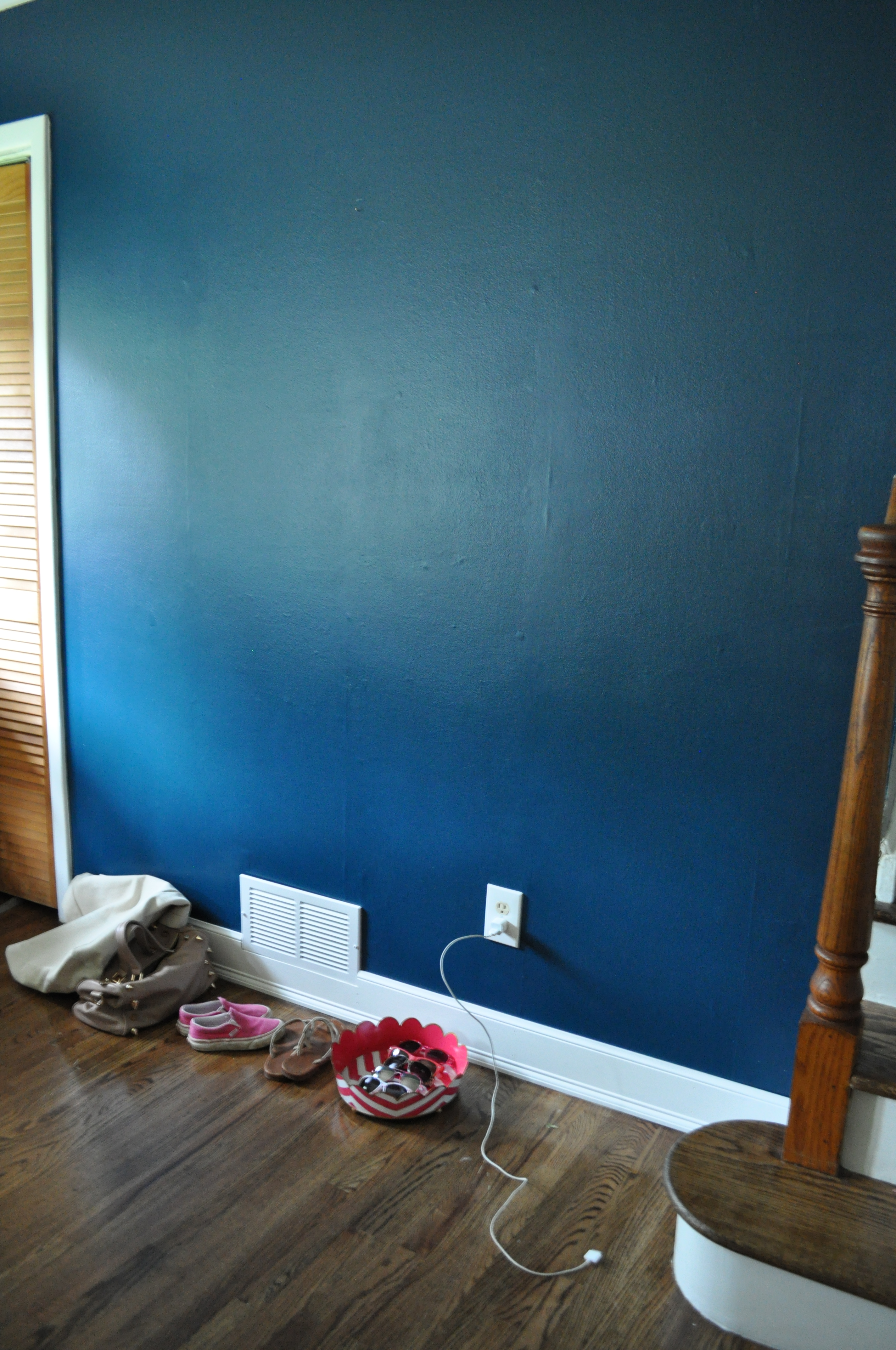
So, I spent a lot of time looking high and low for some curtains for our bedroom. I knew I wanted something that would really pop against our blue walls. Something in either a bold red or a rich purple or even a major print. There were many I fell in love with – most from Anthropologie. Some are long gone now but the ones I was loving are similar to these:

The Marrakech Curtain – This would add an eclectic vibe.

Wandering pleats – I love that rich purple color.

And the new Swing Stripes curtain (they’ve got POM POMS! And I love me some pom poms!)

Since an Anthro curtain can run you from $148-188 per panel, these were all out of the question. (I needed 4 panels and there was NO way I would be spending $600+ on curtains when I don’t even have a grown-up bed.  More on that at a later date.)

Then I started looking through the curtains at Anthropologie’s little sister, Urban Outfitters, and there were a lot of pretty prints. They’re all much lighter, semi-sheer cottons but I kind of like that look so I didn’t mind. (Remember, I’ve got an aversion to thick, fancy, old ladyish “draperies”.) I was thrilled when I found this amazing one that was kind of flourishy in purple, orangey-red and even a little of a light blue that kind of worked with our walls. (It’s still available in other colors.)

I bought the longest length they had (84″) and I hung the rod a little bit above the window so the curtains skimmed the floor. I don’t have a picture of this because I was embarrassed by how it looked.  Here’s the problem: We all know that curtains need to be hung as close to the ceiling as possible so I knew I was trying to cheat and get away with a cheap solution. What was I thinking? (I know actually. I was thinking about doing it as cheaply as possible.)

In case it’s unclear what I mean, check out the great post from Erin Gates of one of my favorite blogs, Elements of Style. She illustrates the problem in the most simple way:

Hanging curtains way up there just makes the ceilings look higher – and it gives the room a French boudoir feel to it. Ooh la la!

 But I had 84″ curtains and I needed 96″. So how to deal with too-short curtains? I ordered 1 extra panel from Urban and they were on sale at that point so I got it for a song. Then I brought all 5 of the panels to my tailor (that sounds so fancy but it’s just my dry cleaner who hems stuff for me!) and asked her to cut the extra panel and add an extra 12 inches to the bottom of each curtain. Is it perfect? Nope! But I asked my dry cleaner to do it and I think she charged me $20 for all 4 panels so I’m not going to complain. (If I had done it myself, I probably would have been a little more anal particular about lining up the print perfectly but I’m quite sure they would not have been sewn straight.) See how messed up there are?

It’s pretty obvious there but when I pull back it’s not as bad. I don’t think anyone would notice unless I pointed it out. See?

One cheap place where you can always count on finding long curtains is Ikea. They sell most panels in one long length that comes with hemming tape so you can make them any length you want. We have these polka dot ones in S’s room. I think they look great and they were so cheap. You can’t beat $13.99 for a pair! The hot pink crinkle sheers are from here.

Since I finally took some decent pics of our master, this will be the first in a series of posts about what’s happening in the bedroom. (No. Not that stuff! Get your head out of the gutter!) So, make sure you subscribe to Sue at Home to see all the action. (Decorating action! Jeez. You should be ashamed.)

XO

Sue at Home

Before and After, Decor, Family, Home, My house, Uncategorized

DIY Painting for the Dining Room

Allow me to reintroduce you to my dining room. Dining room, readers. Readers, dining room. You might remember that you met this room back in this post but here’s the recap. This was our dining room before we moved in. Simple. Subtle.

Cream and brown.

Here’s how it was recently.

The only big problems were 1) the too-short curtains that need to be replaced by something that goes all the way to the ceiling and 2) that weird art by yours truly. The curtains are going to take a little time to hunt down but I got to work on the painting yesterday. I was inspired by this picture I had seen on Amber Interiors but I wanted to do it with a gold background instead of silver. (Yes, I know that silver would “go” better with the gray walls but that’s precisely why I want to use gold. You get me, right?)

OK. So we’re all recapped now. Let the painting begin!

I used Craft Smart acrylic paints from Michael’s in Gold and Neon Pink. I actually had to make a run to the store to get more Neon Pink. That’s what happens when you share your paints with 2 little girls. (Who am I kidding?  I used it all myself!)  I made my first coat and I could still see some of the other colors through it. I liked it on the pink part but the gold was just looking greenish. (Also – please note my amazing art studio. It’s called laying-newspaper-down-on-the-living-room-floor-and-leaning-over-the-painting. Really fancy, huh?)

But luckily after a few coats later, it was finally covered – with just a little bit still showing through the pink part.

I actually like that little bit peeking through the pink. Nothing like a happy mistake!

So, it’s good…for now. I’m quite sure I’ll be changing it in a few months, but until then, I’m content.

And I’m not the only one who likes it.

XO

Sue at Home

\