Before and After, Decor, Home, My house

House Tour: Living Room

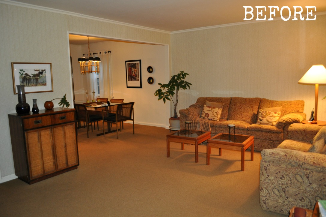
This is another one of those posts where I’m like, “What? I didn’t write that post yet?”. I mean, I’ve talked about our living room’s gallery wall and pink chair plus every detail of our foyer (which is part of our living room), but I’ve never talked about the living room itself. It’s even been featured on Apartment Therapy and yet I haven’t given you a full tour of the room! So, since I’m sure you’ve been dying to know where I got every last bit of it, here is the full tour and resource list. (And of course a beige-tastic “before” photo to start things off!)

LIVING-ROOM-BEFORE-DSC_1227

living room 021

living-room-023

Paint: Benjamin Moore Teal

Rug: RugsUSA

Frames: Kohls

Manhattan Map: These Are Things

NYC area art: Aaron Straup Cope from 20×200

Canvas prints: Shutterfly

More detailed info about the gallery wall can be found here.

living-room-112

Media Console (we have two pushed together):  CB2

Copper balls: Design Within Reach Annex (read their interesting history here and here)

Apple Bookends: Happy Chic by Jonathan Adler

living-room-053

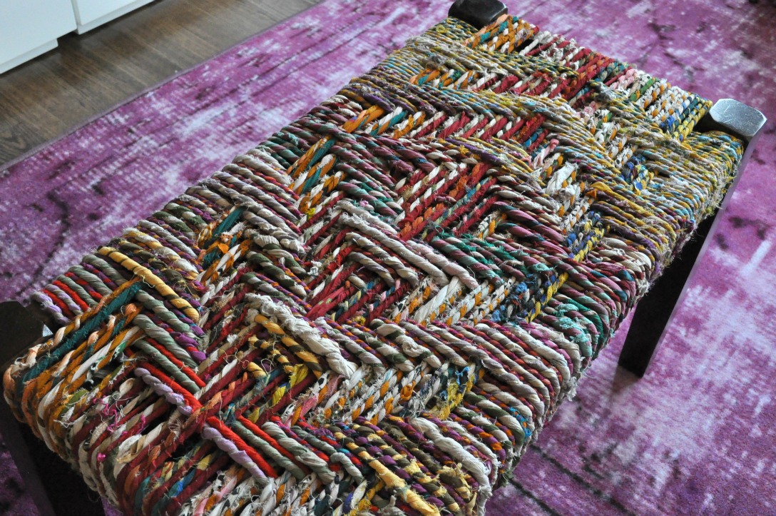
Woven rag bench: Threshold at Target

living room 049

Chair: PB Teen with my custom dye job (no longer available at PB Teen so try this one instead)

Je T’aime pillow: Atsuyo et Akiko

Garden stool: Home Goods

living room 047

Roman shades: Handmade by the former owner. They came with the house!

Arc lamp: CB2

living-room-086

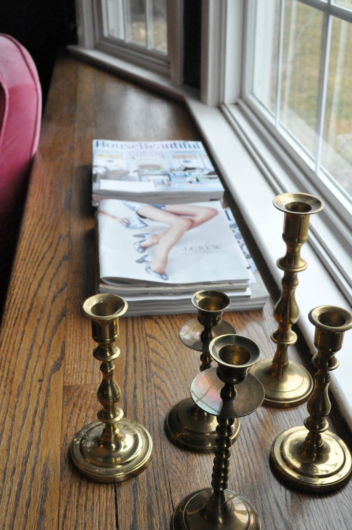
Brass candlesticks: Unique Thrift store (about $2 a piece!)

living room 064

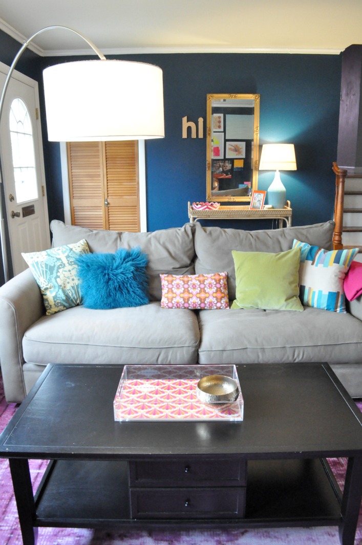
Coffee Table:  old one from Pottery Barn (similar here)

Couch:  really old one from Macy’s (similar here)

Pillows: printed on left (Country Lanes via Etsy), Monglian lamb (Pier 1, similar here), printed in middle (Nora Jane via Etsy), velvet (Crate and Barrel, similar here), printed on right (Eleen via Etsy)

Pink cashmere throw: Ann Taylor (Yup, you read that right! It was from a few years ago.)

living room 051

Lucite Tray:  Jonathan Adler

Brass bowl: Nate Berkus for Target (no longer available)

living room 074

living room 070

Foyer table:  Serena and Lily (Scored for less than $100! Read the story here.)

Lamp: Target base and shade

Chevron bowl:  Jayes via One Kings Lane

Runner:  Ballard Designs

Mirror:  it was my grandma’s :)

Hi letters:  Land of Nod with Krylon Metallic Spray Paint (read the tutorial here)

Orange frame:  C. Wonder

Brass bowl:  Nate Berkus for Target (no longer available)

More about the foyer in these posts: the inspiration, the decorations, the table, and the reveal.

living-room-067

living room 025

living-room-033

Dining Room and Hallway Paint: Benjamin Moore Coventry Gray

Antique chest:  My parents bought it at a neighbor’s yard sale over 20 years ago!

living-room-042

Map:  Future Map

living-room-035

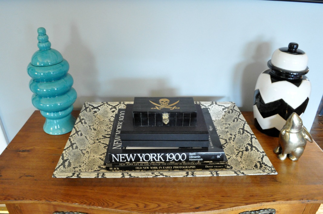
Snake tray – Furbish

Skull box – a gift

Brass bunny – Antiques and Collectibles Too (read about where I found him here)

Turquoise vessel – TJ Maxx

Chevron urn – Nate Berkus for Target (no longer available)

Hope you enjoyed the Living Room tour. It sure is a lot more colorful than it used to be!

living-room-before

LIVING-ROOM-BEFORE-DSC_1275

Check out more House Tour posts here.

XO

Sue at Home

Before and After, Decor, Home, My house

House Tour: Master Bedroom

If you feel like you’ve already seen our master bedroom, you’re right. But you see, I realized when I was writing about all the Urban Outfitters stuff in our house that even though I wrote a lot of posts about our master bedroom (8 in total!), I never gave a proper piece-by-piece room tour with resource listings. (Bad blogger!) So, here it is.

master-bedroom-401

Headboard – found in the garbage room of my first apartment about 20 years ago!

White sheets and white pillow casesLands’ End

Duvet cover – Lands’ End (No longer available. Similar available…well,nowhere!! Read all about my hunt for it here.)

Bed skirt – JC Penney (No longer available)

Shams – Urban Outfitters (No longer available. Similar here.)

Chevron pillow – Lands’ End (No longer available. Similar here.)

Linen PillowAtsuyo et Akiko (I’ve now moved it to my living room where it sits in the pink chair.)

master-bedroom-656

 RugUrban Outfitters

master-bedroom-446

Nightstands – Pottery Barn (No longer available. Similar here.)

Lamps on Nightstands – Martha Stewart  from way back – before the Macy’s & Home Depot lines – when she carried stuff like this on her website. (Similar here.)

master-bedroom-671

Pill-shaped carafe and glassJonathan Adler

master-bedroom-426

Printed curtains – Urban Outfitters  (No longer available. Similar here.) Find out how I magically lengthened them here.

Black curtain rodsIkea

White curtains – Ikea (No longer available. Similar here.)

Hidden curtain rodHome Depot (A genius solution when you want two curtains. Check out the price!)

master-bedroom-089

Vintage dresser – Craigslist

FramesPottery Barn

master-bedroom-081

Lucite tray – Home Goods (similar here)

Square Bowl – gift so I don’t have a resource (similar here)

Footed bowl – I had this for so long, I can’t remember where I got it! (similar here)

master-bedroom-001

DresserIkea

For Like Ever posterSuper-Rural

Poster frameTarget

master-bedroom-018

Frame with necklacesPottery Barn (I spray painted it black)

Wrapping paper in frame – Old Navy (no longer available)

Black lacquered boxContainer Store

Red metallic pigDaytrip Jr.

It’s still a work in progress (I mean, why would you ever want to STOP decorating?) but it’s come a long way from the bland creamy cream room it once was, huh?

master before

For more posts about our master bedroom, check out these links:

Master Bedroom Inspiration: Olatz Schnabel

The Hunt for Master Bedroom Bedding

DIY: Lengthening our Master Bedroom Curtains

I Will Love This Poster For Like Ever

Jewelry Storage: A Work in Progress

Jewelry Storage: Phase 2

DIY: Quick and Easy Jewelry Display

 What’s Wrong With My Bedroom

XO

Sue at Home

Before and After, Decor, Home, My house

I Have a Hot Pink Chair!

I have been wanting a hot pink couch or chair for like ever. Remember when I showed you all those dreamy pink pics and told you I was thinking about dying an old slipcover I wasn’t using? Well, I did it!

Here’s the best part: this renovation cost less than $10. That’s right! Ten buckaroos! How, you ask? Well, I already had the chair and a pale pink slipcover. The chair is from PB Teen but unfortunately for you, they don’t make it anymore which I think is a crime to humanity because it’s comfortable, cute and cheap and for quite a while, they were offering slipcovers in different fabrics and patterns. When I got the chair, I picked up three velvet covers: white, bubblegum pink, and pale blue. (What? I figured the chair could be used in other rooms so I wanted to have options! That’s normal to buy three, right? ) Of course, I’ve only ever used the white one.

I decided to use RIT dye in fuschia. The directions called for 1 package of dye for every pound of fabric so I went for three since my slipcover was nearly 3 pounds. I couldn’t find a bucket big enough so grabbed this color-coordinated (!!) storage bin at Home Depot and got to work. First step, fill the bucket with 9 gallons of hot water:

Then I mixed 3 packages of dry dye with 6 cups of hot water and stirred it very well until all the dye dissolved. (Note: it did not stain my measuring cup. Bonus!)

Then I added the mix to the dye bath and stirred. (Please note that I did all this on my deck and I was wearing rubber gloves. They are not kidding about the staining possibilities so take all the warnings seriously! If you don’t believe me, come and ask the few pink dots on my kitchen countertop.)

Before adding the slipcover, I pre-wet the fabric in hot water so the color would penetrate the fabric evenly. (Having the lid to the storage bin was helpful for this step because it gave me something to carry the wet fabric on.)

And then in it went! Next up, I stirred and stirred and stirred for about 25 minutes. If you’ve never pushed a sopping wet pile of velvet around with a paint stick before, I can tell you that you will use muscles you didn’t even know you had. Ouch!

Next up, I rinsed it in the utility sink (which is now pink) in my laundry room. First in warm water, then cooler until it ran clear. This was another special type of muscle torture that I wouldn’t wish on my worst enemy! Then the scariest part of all – into my beautiful new-ish washer it went! (Don’t worry. The washer came out unscathed.)

I gave it an air-only dry in the dryer and ta-dah! Here is the finished product!

My wise husband (who so kindly signed off on this project before I did it and then called it “awesome” because he knew how excited I was about it) was the one to point out the patterned pillow was a little too much. So, I stole the Je T’aime pillow (similar here) that used to live on our bed. Much better, don’t you think?

I love how the pink looks against the dark teal walls.

The color came out so even. I’m actually mad at myself for being so scared to do this for so long!

I love the way it pops in the room.

Maybe now guests will sit in the chair. They were always kind of scared of it when it was white.

Oh happy day! I have a hot pink chair!

XO

Sue at Home

Disclaimer: Please do not dye anything hot pink in your home without running it by your significant other. I’ve learned that though there are many people who like the looks of hot pink furniture, there are not a lot of people brave enough to go for it. And there are many, many more people who are terrified of it. Thankfully, my husband is comfortable enough in his sexuality to not be so concerned about a little pink in his house. (Though maybe he should because I could possibly love this chair more than I love him. Kidding, honey!)

Before and After, Home, My house

Before and After: New Landscaping

When we moved into our house a year and a half ago, we didn’t think much of the shrubs. Since we were coming from a townhouse where we didn’t own the outdoor space (and an NYC apartment before that) we knew very little about things that grow.  But after a year of not seeing much life around our house, we knew the shrubs had to go.

Here’s what the landscaping looked like the day we closed on the house. Overgrown in some areas and dead in others. And the only decent shrubs were the prickery ones on either side of the door. It was like saying to our guests, “Welcome to our home. And now we will prick you with our pricker bushes.” And that’s just not my style.

Sure, this picture was taken in the winter but I can assure you, not much popped up in the year that followed. (That is, aside from the huge row of forsythia down the side of the house that blooms beautifully in March each year. You can see them on their way out in the pic below.) So, we decided to rip it all out. And suddenly, it looked better already! You’ll also notice below that we had several of the lower branches on the tree cut off so that we wouldn’t have them hanging down in front of the house.

We worked with a landscaper who recommended trees, shrubs, and flowers based on our laundry list of requests. Even though we knew so little about this stuff, we highly considered DIYing it but I’m really glad we hired a pro.  I found that his price was not much more than the shrubs alone would have cost us and if I had added in the truck rental and mulch and the shovels and edgers, it would have been pretty comparable. And I’m sure we would have screwed it up somehow! (Local readers: We used First Class Landscaping right here in town and I highly recommend them. Just ask and I’ll give you Jeremy’s number.)

When they arrived to install everything, it was the morning after my 40th birthday so Pablo and I were in no state to supervise. But luckily, Jeremy and his team did a great job on their own. Here’s everything  in place getting ready to be planted. (There were also a few small perennials that were added in around the ones pictured below.)

They did such a great job with everything.

We were just smitten with the edging. (What is it about that? It’s so simple but it just looks so crisp!)

 Let’s take one last look at that scary overgrown and half dead “before” shot.

And now – TA DA! – the “after”!

There are still quite a few things I’d like to do to the exterior, like painting the door (glossy black? red? yellow? blue?), installing some new lighting and I might want to paint the shutters too. (They’re charcoal grey now and I think it would look much more better if they were black.) Suggestions welcome!

Have you done any landscaping lately? If  so, I want to hear all about it! Let me know in the comments.

XO

Sue at Home

Decor, Home, My house

The Hunt for Master Bedroom Bedding

Last week, when I told you about the room that inspired our master bedroom palette, I touched upon the decadent, sumptuous, to-die-for bedding from Olatz Schnabel that graced her bed in our inspiration picture. I would have loved a full set of her bedding but I don’t have a spare $4000 sitting around so it’s not going to happen. But, that’s no reason not to dream a little and try to find a similar solution.  Here are a few shots of Olatz‘ bedding line. Let the drooling begin.

Olatz Schnabel (the person) draping her gorgeous self across her gorgeous bedding (from Olatz, the bedding line) on her gorgeous bed via Pursuit of Style (It’s just wrong to look that good.)

A clear shot of the full set via Olatz. The sham is only $300. Maybe I could just get one??

The pink and red version  in ELLE Decor with…wait. What is that? Yes. Yes, that is a MATCHING HEADBOARD. Just kill me now.

This famous cover is like a trifecta of style obsessions: Domino + Jenna Lyons + her Olatz bedding = my head about to explode! Throw in black painted walls and that fireplace and I’m dead. Dead. via Habitually Chic

The Bowery Hotel apparently has Olatz bedding in every room. May I move in, please? (This pic via NY Mag)

When GQ (my first job was the Fashion Closet Assistant there!) did a story on the best bedding, of course they needed to include Olatz bedding. Insert cute girl in bra and panties to GQ-ify it.

Little Green Notebook did a makeover on Joanna Goddard‘s bedroom and she had an Olatz-ish duvet made for the room. Perhaps this is an option for me? (Still can’t be cheap though…)

CarolynMAKING has a great no-sew (!!) DIY of the Olatz bedding. She did an amazing job but I feel like I could screw up something  even this simple.

The crazy thing is that I look at these pics and think, “Everyone makes duvets like this. I’ve GOT to be able to find something similar.” But the problem is the colors. You just can’t find that bright orangey red or that regal purple at mass brands. Pottery Barn makes a nice duvet and sham with a band of color. But in classic “Pottery Barn style”, the color choices are basically beige, beige and more beige.

I found our current duvet at Lands’ End about 9 months ago. They don’t have it anymore but I highly recommend their bedding. It’s super soft, really nice quality and priced very reasonably.

It’s frustrating to know there’s got to be something similar out there and just not be able to find it.  (Please let me know if you have a resource for me!) I might just have to try the DIY. If I do, you know you’ll hear all about it! Until then, I’ll live with my subtle stripes because let’s face it, that old way-too-small headboard is a much bigger problem than the duvet! More on that later….

XO

Sue at Home

Before and After, Decor, Family, Home, My house, Uncategorized

DIY Painting for the Dining Room

Allow me to reintroduce you to my dining room. Dining room, readers. Readers, dining room. You might remember that you met this room back in this post but here’s the recap. This was our dining room before we moved in. Simple. Subtle.

Cream and brown.

Here’s how it was recently.

The only big problems were 1) the too-short curtains that need to be replaced by something that goes all the way to the ceiling and 2) that weird art by yours truly. The curtains are going to take a little time to hunt down but I got to work on the painting yesterday. I was inspired by this picture I had seen on Amber Interiors but I wanted to do it with a gold background instead of silver. (Yes, I know that silver would “go” better with the gray walls but that’s precisely why I want to use gold. You get me, right?)

OK. So we’re all recapped now. Let the painting begin!

I used Craft Smart acrylic paints from Michael’s in Gold and Neon Pink. I actually had to make a run to the store to get more Neon Pink. That’s what happens when you share your paints with 2 little girls. (Who am I kidding?  I used it all myself!)  I made my first coat and I could still see some of the other colors through it. I liked it on the pink part but the gold was just looking greenish. (Also – please note my amazing art studio. It’s called laying-newspaper-down-on-the-living-room-floor-and-leaning-over-the-painting. Really fancy, huh?)

But luckily after a few coats later, it was finally covered – with just a little bit still showing through the pink part.

I actually like that little bit peeking through the pink. Nothing like a happy mistake!

So, it’s good…for now. I’m quite sure I’ll be changing it in a few months, but until then, I’m content.

And I’m not the only one who likes it.

XO

Sue at Home

\