Before and After, Home, My house

Before and After: New Landscaping

When we moved into our house a year and a half ago, we didn’t think much of the shrubs. Since we were coming from a townhouse where we didn’t own the outdoor space (and an NYC apartment before that) we knew very little about things that grow.  But after a year of not seeing much life around our house, we knew the shrubs had to go.

Here’s what the landscaping looked like the day we closed on the house. Overgrown in some areas and dead in others. And the only decent shrubs were the prickery ones on either side of the door. It was like saying to our guests, “Welcome to our home. And now we will prick you with our pricker bushes.” And that’s just not my style.

Sure, this picture was taken in the winter but I can assure you, not much popped up in the year that followed. (That is, aside from the huge row of forsythia down the side of the house that blooms beautifully in March each year. You can see them on their way out in the pic below.) So, we decided to rip it all out. And suddenly, it looked better already! You’ll also notice below that we had several of the lower branches on the tree cut off so that we wouldn’t have them hanging down in front of the house.

We worked with a landscaper who recommended trees, shrubs, and flowers based on our laundry list of requests. Even though we knew so little about this stuff, we highly considered DIYing it but I’m really glad we hired a pro.  I found that his price was not much more than the shrubs alone would have cost us and if I had added in the truck rental and mulch and the shovels and edgers, it would have been pretty comparable. And I’m sure we would have screwed it up somehow! (Local readers: We used First Class Landscaping right here in town and I highly recommend them. Just ask and I’ll give you Jeremy’s number.)

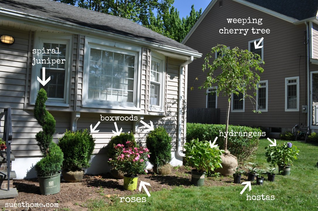
When they arrived to install everything, it was the morning after my 40th birthday so Pablo and I were in no state to supervise. But luckily, Jeremy and his team did a great job on their own. Here’s everything  in place getting ready to be planted. (There were also a few small perennials that were added in around the ones pictured below.)

They did such a great job with everything.

We were just smitten with the edging. (What is it about that? It’s so simple but it just looks so crisp!)

 Let’s take one last look at that scary overgrown and half dead “before” shot.

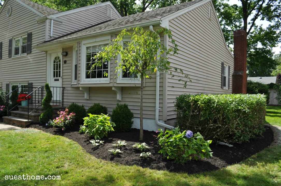
And now – TA DA! – the “after”!

There are still quite a few things I’d like to do to the exterior, like painting the door (glossy black? red? yellow? blue?), installing some new lighting and I might want to paint the shutters too. (They’re charcoal grey now and I think it would look much more better if they were black.) Suggestions welcome!

Have you done any landscaping lately? If  so, I want to hear all about it! Let me know in the comments.

XO

Sue at Home

Before and After, Decor, Home, My house

Jewelry Storage: A Work in Progress

In our old house, we had an enormous master bathroom where I had enough room for a dresser whose sole purpose was to store my jewelry. Let your head absorb that for a moment. An entire dresser for jewelry! Now, in my small master, there’s barely a dresser top and one drawer for my baubles. Which means that most of them live in bags in the closet. It’s sad, really.

So, my jewelry storage isn’t perfect but it’s working for me…for now. Check it:

The neon orange acrylic tray was a Home Goods find. It’s lived all over the house but I like it best for my jewelry. I keep most of the everyday options in here – some long chain necklaces, wrap bracelets, and some bangles –  big and small.

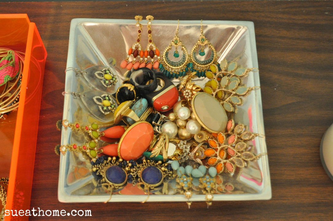
I store my cocktails rings and my dangley earrings in this  little square silver bowl. (I can’t for the life of me remember where I got it. I certainly don’t love it but it does the job so for now, so it stays!)

My wedding band, engagement ring and watch live in an ashtray when I’m not wearing them. I got it in Paris and – full disclosure –  I can’t imagine how it ended up in my handbag. (I’ll blame the caviar and vodka.)

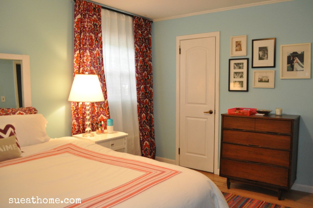
Some of the bigger statement pieces – necklaces and bracelets –  live in the top drawer of the dresser.

The “drawer liner” is actually wrapping paper that I got years ago at…you’re never going to believe this…Old Navy. Crazy, right? I love it and I might frame a piece of it to display in front of the poster in the room.


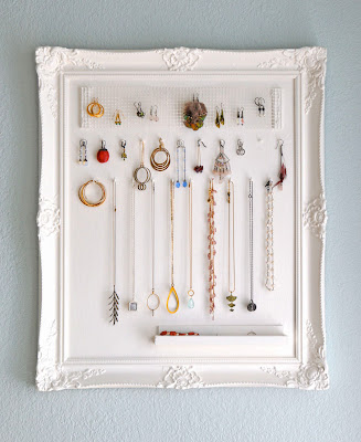
If you’re willing to dedicate a little more space to jewelry storage, here are some good ideas:

Monaluna‘s frame with hooks

Jewelry as wall art at BH&G

Catherine of Hallelu on the Glitter Guide

Cabinet and bowls via Martha Stewart


The great embroidery hoop trick via Apartment Therapy

Sherry’s baubles in an egg crate via Young House Love

I have way too many pieces to do any of these options (remember, you’re only seeing a fraction of my collection in the pics above) but as the mom of two girls, I know I’ll regret parting with any of it. Think of all the future “dress-up” parties we’ll need things for, right??

Tell me…how do you store your jewelry?  Or better yet…how do you pair it down?  For now, I’ll horde mine in the little bit of space I have…

XO

Sue at Home

Decor, Home, My house

The Hunt for Master Bedroom Bedding

Last week, when I told you about the room that inspired our master bedroom palette, I touched upon the decadent, sumptuous, to-die-for bedding from Olatz Schnabel that graced her bed in our inspiration picture. I would have loved a full set of her bedding but I don’t have a spare $4000 sitting around so it’s not going to happen. But, that’s no reason not to dream a little and try to find a similar solution.  Here are a few shots of Olatz‘ bedding line. Let the drooling begin.

Olatz Schnabel (the person) draping her gorgeous self across her gorgeous bedding (from Olatz, the bedding line) on her gorgeous bed via Pursuit of Style (It’s just wrong to look that good.)

A clear shot of the full set via Olatz. The sham is only $300. Maybe I could just get one??

The pink and red version  in ELLE Decor with…wait. What is that? Yes. Yes, that is a MATCHING HEADBOARD. Just kill me now.

This famous cover is like a trifecta of style obsessions: Domino + Jenna Lyons + her Olatz bedding = my head about to explode! Throw in black painted walls and that fireplace and I’m dead. Dead. via Habitually Chic

The Bowery Hotel apparently has Olatz bedding in every room. May I move in, please? (This pic via NY Mag)

When GQ (my first job was the Fashion Closet Assistant there!) did a story on the best bedding, of course they needed to include Olatz bedding. Insert cute girl in bra and panties to GQ-ify it.

Little Green Notebook did a makeover on Joanna Goddard‘s bedroom and she had an Olatz-ish duvet made for the room. Perhaps this is an option for me? (Still can’t be cheap though…)

CarolynMAKING has a great no-sew (!!) DIY of the Olatz bedding. She did an amazing job but I feel like I could screw up something  even this simple.

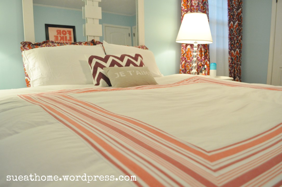
The crazy thing is that I look at these pics and think, “Everyone makes duvets like this. I’ve GOT to be able to find something similar.” But the problem is the colors. You just can’t find that bright orangey red or that regal purple at mass brands. Pottery Barn makes a nice duvet and sham with a band of color. But in classic “Pottery Barn style”, the color choices are basically beige, beige and more beige.

I found our current duvet at Lands’ End about 9 months ago. They don’t have it anymore but I highly recommend their bedding. It’s super soft, really nice quality and priced very reasonably.

It’s frustrating to know there’s got to be something similar out there and just not be able to find it.  (Please let me know if you have a resource for me!) I might just have to try the DIY. If I do, you know you’ll hear all about it! Until then, I’ll live with my subtle stripes because let’s face it, that old way-too-small headboard is a much bigger problem than the duvet! More on that later….

XO

Sue at Home
Decor, Home, My house

I Will Love This Poster For Like Ever

Sometimes there are things that you really want to buy but you just don’t get them for some reason or another. My relationship with this poster was like that.

I saw it on the cover of the Sept 2006  issue of Domino magazine in the home of Jessie Randall of Loeffler Randall and I wanted it bad. And I was not alone. It was an instant design sensation and I recall that it was sold out for quite awhile after. (Can you believe that I still have the issue in my personal archives  – aka on a shelf in my attic?)

But I didn’t get it. And for once, cost was not the problem. I don’t know why I didn’t get it except that since it was way back in 2006, I suppose I was still sort of in newlywed mode and for me, that meant that I needed to grow up and have a mature apartment which did not involve pink posters. (Read more about my design manifesto here and how it has changed over the years.)

But the love did not fade in the past 6 years. So, when Pablo and I decided to do our bedroom over in shades of pale blue with hits of red and purple, I thought about it again. I mean, yes, it’s mostly pink but it’s got a lot of red too. And as I’ve explained before, Pablo is comfortable enough in his manhood to have a little pink around his house. (You know, as the saying goes: Happy wife, happy life.)

So, I did it. It’s finally mine ours. It needs a little styling love in front of it but for now there it is displayed with a big TV and a cable box.  (Sidenote: Have you ever seen a cable box in a decorating magazine or shelter blog? Nope. Where is everyone hiding them?) UPDATE: I saw one on Habitually Chic! Thanks, Heather, for being honest and not hiding it!

Not quite the beautiful accompaniment I always believed it would be surrounded by but it’s a work in progress. (Which is just how I like my home. I mean, what will I do when the renovations and decorating are done?) Some might think a master bedroom should be serene and romantic. But what’s more romantic than the sentiment that I will love Pablo “for like ever”?

For some more ways to display it, check out these inspiration pics:

Propped up against a wall via Adore magazine (Chanel football, anyone?)

Super sweet pink on pink via Carla Lane interiors

So pretty in a modern girly nursery via Small Shop

With cool mid-century furniture in a totally eclectic room via Apartment Therapy

With a red frame and more mid-century furniture via Apartment Therapy

What could be better than a minty wall via Glitter Guide

So, what do you think? Could you put a pink poster in a “grown-up” room? Would the man in your life be okay with that? I’m so glad mine is!

XO

Sue at Home

Before and After, crafts, Decor, Home, My house

DIY: Lengthening our Master Bedroom Curtains

I suppose putting DIY in the title of this post is a little misleading. It should be more like “figure-out-how-to-do-it-and-then-hire-someone-else-to-do-it-because-you-can’t-sew”. That’s a little more honest. But if you can sew then you can absolutely do this yourself. Anyway…

I have a love/hate relationship with curtains. I mean, I get it – I know that they can totally transform a room but I find them to be a little fuddy duddy and too “designer-y” for my taste  – plus they are often A SMALL FORTUNE. For just a piece of fabric. It kinda makes me crazy.

Let me stop and remind you about the inspiration picture for our bedroom. Olatz Schnabel’s bedroom from House Beautiful. Ahhh. I could just stare at this pic all day. It’s so dreamy.

olatz house beautiful

Yes, I’m aware we don’t have high ceilings like that, nor do we have a gajillion dollar bed but still, I figured we can work with the color palette. Just go with it, ok?

(Sidenote: Before I get into telling you about the curtains I ended up with, let’s just gloss over the EPIC CURTAIN FAIL that happened when I ordered 4 red silk shantung panels from Macy’s. Small room with low ceilings + inexpensive but trying-to-look-expensive drapery panels = turning one’s bedroom into a brothel. I’m not talking about a high class Heidi Fleiss kinda place. I’m talking about 8th and forty-deuce. It was HORRIBLE. They were quickly returned and we shall never speak of this again. Okay? Okay.)

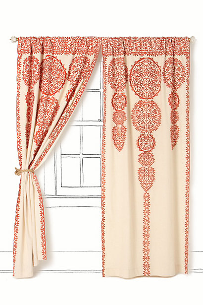
So, I spent a lot of time looking high and low for some curtains for our bedroom. I knew I wanted something that would really pop against our blue walls. Something in either a bold red or a rich purple or even a major print. There were many I fell in love with – most from Anthropologie. Some are long gone now but the ones I was loving are similar to these:

The Marrakech Curtain – This would add an eclectic vibe.

Wandering pleats – I love that rich purple color.

And the new Swing Stripes curtain (they’ve got POM POMS! And I love me some pom poms!)

Since an Anthro curtain can run you from $148-188 per panel, these were all out of the question. (I needed 4 panels and there was NO way I would be spending $600+ on curtains when I don’t even have a grown-up bed.  More on that at a later date.)

Then I started looking through the curtains at Anthropologie’s little sister, Urban Outfitters, and there were a lot of pretty prints. They’re all much lighter, semi-sheer cottons but I kind of like that look so I didn’t mind. (Remember, I’ve got an aversion to thick, fancy, old ladyish “draperies”.) I was thrilled when I found this amazing one that was kind of flourishy in purple, orangey-red and even a little of a light blue that kind of worked with our walls. (It’s still available in other colors.)

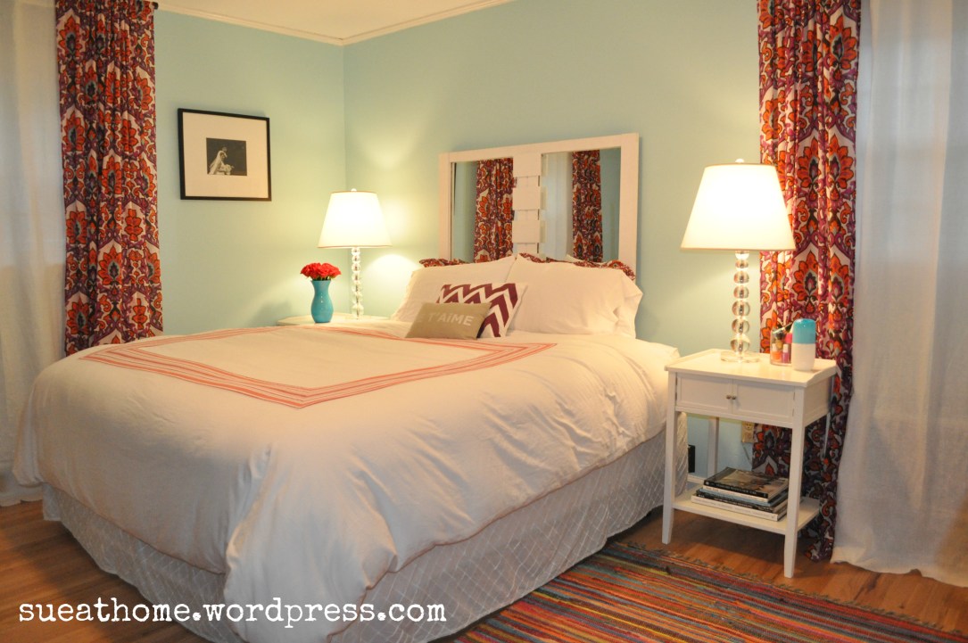
I bought the longest length they had (84″) and I hung the rod a little bit above the window so the curtains skimmed the floor. I don’t have a picture of this because I was embarrassed by how it looked.  Here’s the problem: We all know that curtains need to be hung as close to the ceiling as possible so I knew I was trying to cheat and get away with a cheap solution. What was I thinking? (I know actually. I was thinking about doing it as cheaply as possible.)

In case it’s unclear what I mean, check out the great post from Erin Gates of one of my favorite blogs, Elements of Style. She illustrates the problem in the most simple way:

Hanging curtains way up there just makes the ceilings look higher – and it gives the room a French boudoir feel to it. Ooh la la!

 But I had 84″ curtains and I needed 96″. So how to deal with too-short curtains? I ordered 1 extra panel from Urban and they were on sale at that point so I got it for a song. Then I brought all 5 of the panels to my tailor (that sounds so fancy but it’s just my dry cleaner who hems stuff for me!) and asked her to cut the extra panel and add an extra 12 inches to the bottom of each curtain. Is it perfect? Nope! But I asked my dry cleaner to do it and I think she charged me $20 for all 4 panels so I’m not going to complain. (If I had done it myself, I probably would have been a little more anal particular about lining up the print perfectly but I’m quite sure they would not have been sewn straight.) See how messed up there are?

It’s pretty obvious there but when I pull back it’s not as bad. I don’t think anyone would notice unless I pointed it out. See?

One cheap place where you can always count on finding long curtains is Ikea. They sell most panels in one long length that comes with hemming tape so you can make them any length you want. We have these polka dot ones in S’s room. I think they look great and they were so cheap. You can’t beat $13.99 for a pair! The hot pink crinkle sheers are from here.

Since I finally took some decent pics of our master, this will be the first in a series of posts about what’s happening in the bedroom. (No. Not that stuff! Get your head out of the gutter!) So, make sure you subscribe to Sue at Home to see all the action. (Decorating action! Jeez. You should be ashamed.)

XO

Sue at Home

Home

Master bedroom Inspiration: Olatz Schnabel

If you’re like me, you’re used to devouring image after image of beautiful interiors whether it’s through magazines, blogs or everyone’s beloved Pinterest. But every once in awhile, you hit upon an image that stops you dead in your tracks and just stays with you. For me, that feeling hit when I saw this image of Olatz Schnabel’s bedroom in House Beautiful.

olatz house beautiful

It’s totally elegant but the colors make it completely fun. It features primarily white bedding (my favorite) but with a band of the richest purple I’ve ever seen to make it totally decadent. That aqua wall color (HB said it’s Benjamin Moore Blue Diamond) is totally up my alley but the bedding, rug, art, and draperies make the wall color almost an afterthought.

blue diamond

In case you don’t know who Olatz Schnabel is, here’s the brief: She’s the ex-wife of artist Julian Schnabel (Yes, that’s his art in the room) and she designs a beautiful bedding line called Olatz. (Yes, that would be her line on the bed.) In case you’re thinking of clicking on over there and picking up a set, let me first tell you that a king duvet cover in cotton will run you $1265. What’s that you say? You’d like the linen one instead of cotton? Oh. Then that’ll be $2015. Ouch.

olatz-schnabel-on bed

This more recent shot of the other side of the room, below, featured in T, shows the wall color a lot closer to the real thing. I love how she uses dark frames against the blue wall. Looks like she might have switched out the rug at some point, too.

olatz in t

So, anyway – I pulled this pic from House Beautiful back in the summer of 2010 and held onto it assuming my husband would never sign off on something so “decorated”. All that color would just be too much for him! But after we moved in and we were planning a way to take our master out of the cream zone and into the light, we revisited the picture and–surprise, surprise– I got the okay! Granted, we’re just using the color palette as an inspiration. (Alas, there will be no Olatz bedding or Julian Schnabel originals.)

Just to get a real appreciation for the sad room we’re starting with, check out what our master bedroom looked like when we saw the house. Granted, it’s not hideous. Not at all. But for people who love color, it’s a little “vanilla”. (Forgive the horrible picture!)

So, after I decided on this palette, I started realizing I had so many other pictures in my tearsheet folders or pinned that were in a similar color scheme. I love that they all read as very elegant rooms (even the kid’s rooms in the mix!) but they’re totally fun and not at all “vanilla”.

Check out these red twin beds via Domino (all pics can be found via my Master Bedroom Pinterest board unless otherwise noted.)

domino twins

Love this sexy red bed that comes from designer Miles Redd. Also from Domino.

miles redd red

Little girl’s room via Hi Sugarplum! (I highly contemplated painting Sophia’s vintage bed to look like this awhile back. I still might.)

painted bed

 Australian Designer Diane Bergeron created this room. I saw it on House of Turquoise.

diane bergeron

Purple walls! A divine suzani! I don’t have the original source! (Let me know if you can help.)

purple walls

Love this teen bedroom by Jennifer Flanders Interior Design. What teenager gets a crystal light fixture like that!?

tween room

This is a newbie pin for me. I love it! From Carla Lane Interiors.

carla lane

I have to wonder if any of these were inspired by Olatz’s bedroom!

I’ve finally taken some pics of our bedroom so I promise lots of “After” shots coming soon. For now, a little teaser:

More coming soon! (UPDATE: You can find more pics of our bedroom here!)

XO

Sue at Home

Family

Our wedding: Happy Anniversary!

We’ve come to the end of Wedding Week and I’m so glad that so many of you clicked on the posts. Thanks for sharing the memories with me! Now, it’s time to turn my direction to someone other than you. I promise I won’t get too sappy here. That’s just not my style!

Dear Pablo,

To the best husband, dad, and partner-in-everything that anyone could ever ask for,  I can’t believe it’s been 10 years. Here’s to many more decades together!

I love you, baby!

(Lily and Sophia better throw us an awesome 50th anniversary party when they’re 47 and 44!)

XO

Sue at Home

For more on the wedding, check out these earlier posts:

The setting

The clothes

The decorative details

The family and friends

All photos by Mark Nelson

Family

Our Wedding: What It’s All About

Wedding week continues and after the location, the clothes and the decorative details, we finally get down to what it’s all about:

The people.

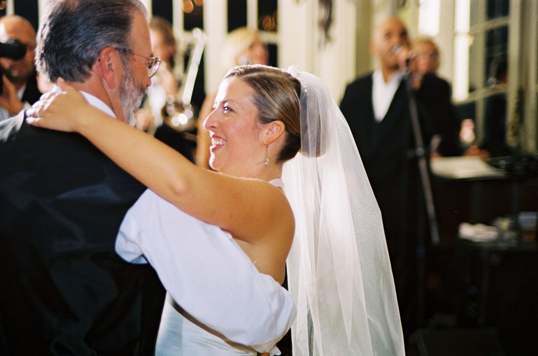
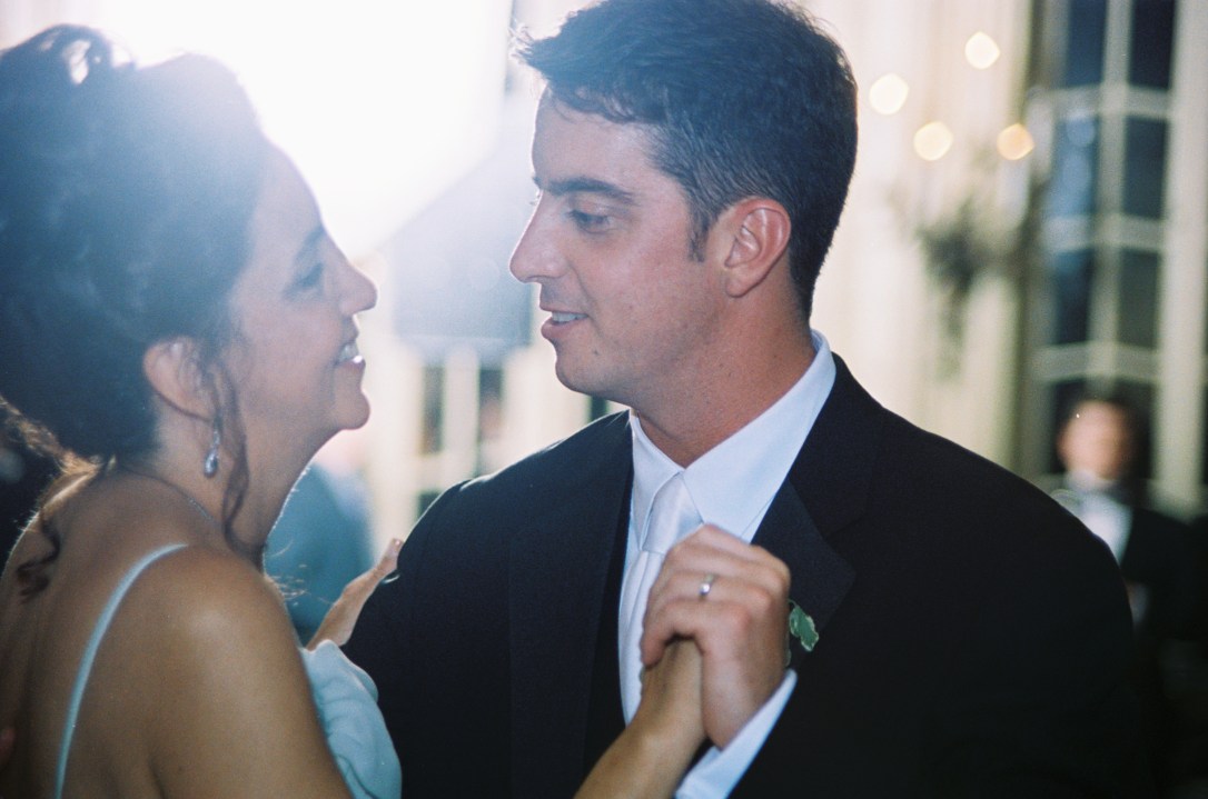
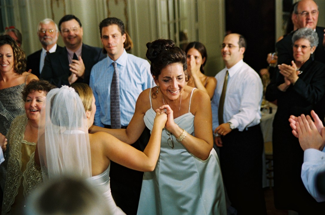
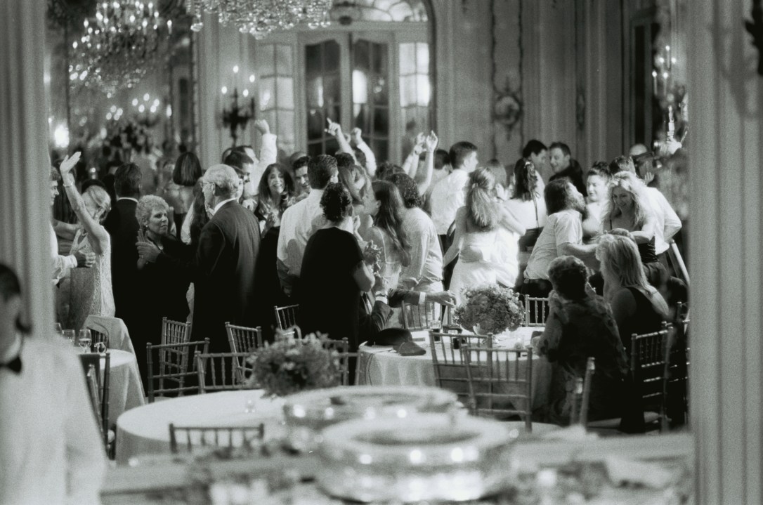
I was sure as the wedding approached that I had it all figured out. I had my lists and everything was designed, booked, and organized. But on the day of the wedding, I realized that all the stressing over cake and flowers and dresses was silly. Because I finally figured out that it’s all about marrying the love of your life surrounded by all the people who love both of you. It was truly surreal to be surrounded by my family and friends and his family and friends and to realize that they were all there for us. I loved seeing “his people” having fun with “my people”. In fact, one of my friends and one of his friends “met again” that night and now they’ve been married for nearly 7 years and just became parents. (Is it wrong that I take a little credit for that?)

So, here is what it’s all about:


The best advice I can give a bride-to-be is just enjoy it. Something will probably go wrong (like, why are there flowers on the cake when they’re not supposed to be there? or what do you mean you don’t have the CD that has our wedding song on it?) but only you can ruin your day. Just brush it off and move on because as long as he shows up, you’re going to have the time of your life. (And I owe it all to youuuuuu! Sorry. Couldn’t resist.)

Did I mention that we were a featured Wedding of the Week on The Knot in 2003. Check it out here.

Plus, check out my other 1o year anniversary wedding posts:

Our Wedding: Newport, Rhode Island

Our Wedding: What We Wore

Our Wedding: The Details

XO

Sue at Home

All photos by Mark Nelson.

crafts, Family, Food

Our Wedding: The Details

First of all, thanks so much for your interest in our wedding! Monday’s post on the setting for our wedding, and Tuesday’s post on the fashion choices were two of my most read blog posts EVER, so thanks!

Today, I’d like to show you some of the details from the wedding. Let me first explain something to the youngins out there: Before Pinterest, there was a wedding binder. And let me tell you, mine was huge! I pulled it out of the attic (of course I still have it!) to take a peek again. Honestly, the binder seems to be the most outdated part of my wedding! The cover, which features a flower inspiration pic and our teal detailed invitation, shows the color palette we worked with. There were also touches of Tiffany Blue throughout the wedding.

Here’s a picture of a flower inspiration page. Pretty, huh? I would have died to have carried a huge arrangement of peonies but they weren’t in season so when I saw this picture of cabbage roses from Martha Stewart Weddings,I was smitten.

The arrangement came out beautifully. It was heavy as hell – but I loved it. (That’s me and my dad before we left the mansion to walk down the aisle.)


Funny story: My dad is no sap but he can be known to get a little sentimental.  So, I warned him. I said, “Dad, don’t you dare turn to me right before we walk down the aisle and say something that makes me cry. I want you to tell me a joke.” And he took this task very seriously. He bought joke books and looked for the perfect one for weeks. Finally, he decided on this short, sweet, and giggle-inducing one: A pig is sitting at a bar drinking beer and after beer. Finally, the bartender asks him if he needs to use the bathroom and he says no thanks. He continues to drink and the bartender is baffled. After a few more beers, the bartender asks again, “Don’t you need to use the bathroom?” and finally the pig says, “No. Don’t you know who I am? I’m the little pig who goes Wee Wee Wee all the way home!”

Thanks Dad for the potty humor when I needed it the most. (You can actually see me gaffaw in the wedding video!)

Ok – back to the decorative details:

The bridesmaids all carried different flowers in various shades of pink. Everything from hydrangeas to daisies to snapdragons. They were small and simple and they looked great. (For more about the bridesmaids dresses and where you should NOT get yours, check yesterday’s post).

For centerpieces we had some low and some tall and they were mixes of pinks and greens.  I spent weeks making beaded table numbers but they were a bit of a bust. In fact, they’re crooked and you can’t even see them in these pics. I feel like I need to explain: I took wires, added large silvery clear beads and bent the wires in the shapes of the table numbers. Then I had the florist insert them into the centerpieces. Unfortunately, they were too small/clear and no one could see them. Oh well.


One of my favorite flower arrangements was the huge one in the Music Room. As guests arrived, they entered through the foyer and then were directed into this small blue room that had a large arrangement in it with all the seating cards stuck in the arrangement. (I guess sticking things into flowers was a big thing 10 years ago! Or at least I thought it was!)

Now to the yummiest detail – the cake! Now listen, my mood on my wedding day was one that I have never had before or after. (Yes, even different than the birth of my kids.) I was giddy, elated, and high-on-life. I drank several glasses of champagne throughout the evening and none of it touched me. It was like I was drunk from the day itself and nothing else could compare. So maybe you don’t want to trust me when I tell you that my wedding cake was The. Most. Delicious. Cake. Ever.

But it was.

It was simple – white cake with buttercream and chocolate ganache covered in fondant. And now that I think of it, I need to take a trip to Fall River, Massachusetts and get an anniversary cake sometime this summer from Confections.  We rented the vintage cake stand from the bakery and I think it really added the perfect touch.

Our favors were another favorite detail of mine. I discovered early on when we were dating that our initials were the same as the initials for salt and pepper (S&P) so it was natural that we gave shakers as our favors. I found these great stainless steel ones from Crate and Barrel which featured holes in the shape of the letters S&P. I found acrylic boxes to put them in and I decorated each one with a wide silk blue ribbon and a label that said “S&P  – Love is the Spice of Life – July 27, 2002”

The best is that they’re totally personal. They wouldn’t make sense for anyone but us. Unless you have S&P initials, of course! I’m happy to say that many of our friends use them everyday – and we do too!

Hope you enjoyed all the details of our wedding! Stay tuned for more wedding fun tomorrow.

XO

Sue at Home

Family, Fashion

Our Wedding: What We Wore

On Friday, Pablo and I will celebrate 10 years of marriage so in honor of the big day, I’m having Wedding Week here at Sue At Home. Yesterday, I introduced you to Newport and the Beechwood mansion.

Today, the clothes!

As a fashion editor, I had a special kind of pressure when shopping for my wedding dress. I looked EVERYWHERE and tried on every dress in existence. Finally, I fell in love with a halter gown from Carolina Herrera with a pleated organza underskirt that peaked out underneath and swung in a huge train in the back. I loved it then and I love it now. Considering it was 10 years ago, I think I should be sort of mortified by what I picked but alas, I’m not. Check out this amazing ad with my dress from way back then. (I showed it to S and L today and L said, “Why is she playing chess and not at a wedding or something?” Good question, kid.)

The closest pose I have is the one below where I sat down in someone else’s seat while my dad made a speech. I love this picture. (The dress didn’t bustle so I just dragged it around all night. It was filthy by the end of the night but I didn’t care!)

I was an editor at ELLE at the time of the wedding so I was able to order my dress directly through the Carolina Herrera showroom and have all my fittings done there by the head of her atelier. If I were you, I might want to punch me after reading that but I promise that I know I was incredibly lucky to have that treatment and I pinch myself just thinking about it. Even as my wedding diet kicked in, they did an amazing  job altering everything so that it fit like a glove. It fit so perfectly that I didn’t even have to wear a bra which is a testament to both their talent and my pre-kid boobs. (That’s right. I just linked something to that phrase. You’ll have to click it and see what it goes to!)

I wore a blusher and a full length veil for the ceremony and then removed the long one and left the shortie on for the reception. Yes, I am one of the those people who wore her veil for the whole night. I’m kind of old fashioned like that.


As for shoes, I spent a ton on a pair that no one saw. Advice for brides-to-be: Get something under $250, like these, and spend some money on a nice pair of sandals for your honeymoon instead.  FYI: They were Manolo Blahnik and they were similar to these but in champagne satin. I wish I could show you a picture but there isn’t one!

My bridesmaid’s wore cream lace strapless cocktail dresses that were custom made from Blue on St. Marks Place in NYC. I don’t think the place still exists but if it does, DO NOT go there. The woman is crazy and a few of the dresses barely made it to the girls on time. And they were made like crap. You can see on the wedding video how my ladies are repeatedly pulling their dresses up while dancing. My maid-of honor wore a sleeveless v-neck version. That smart girl avoided the potential nip slips the other bridesmaids were dealing with all night. All that dress trouble for this photo opp. Thanks ladies!

For my main man’s attire, I sat Pablo down for the Oscar pre-show and made him watch the red carpet to pick out his look. He loved Benjamin Bratt’s classic black tux with a black vest and a long white tie. And I agreed! By using some store credits and an editor discount, I was able to score him a Burberry tux for a few hundred dollars! (That’s me – always bargain hunting!) The tie was from Saks. I’m pretty sure it was Brioni. Doesn’t he look handsome – and so young! – in these pictures?

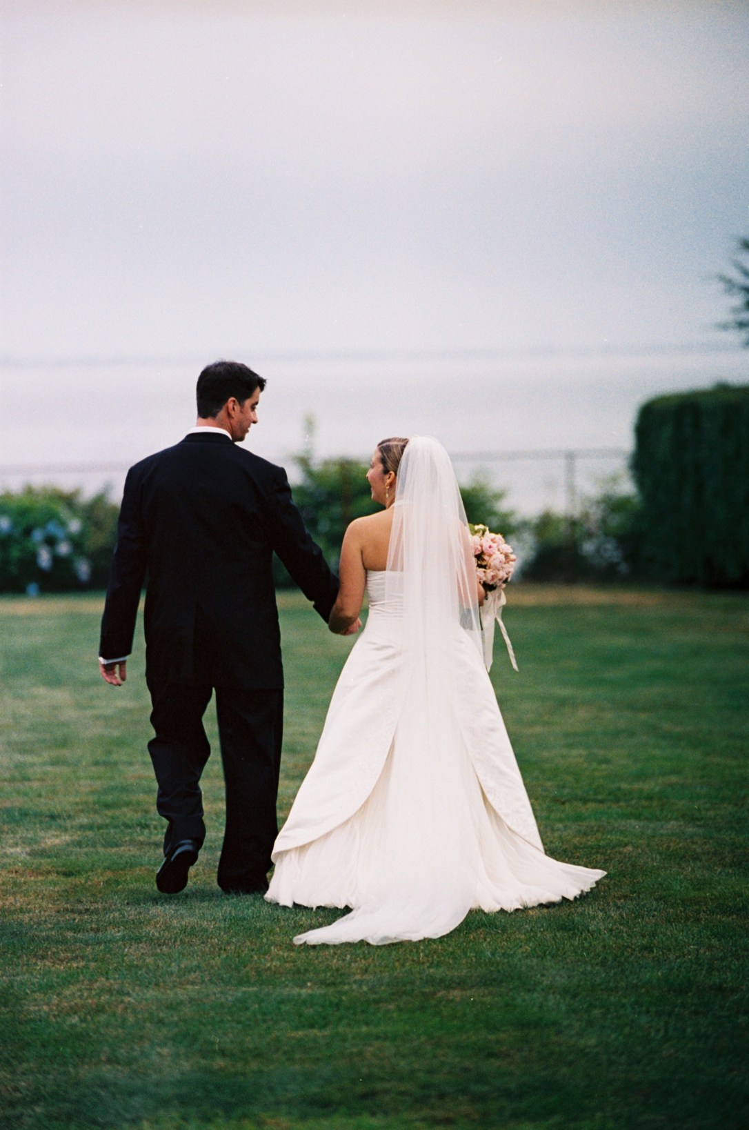
There we are giggling and happy. It really was a very magical day! Stay tuned for more wedding pics all week long as we lead up to our 10 year anniversary on Friday.

XO

Sue at Home

All photos by Mark Nelson except for the Carolina Herrera ad which was a picture I took of the ad from an old magazine. (How the hell else am I supposed to credit that?)