Before and After, Decor, Home, My house

House Tour: Master Bedroom

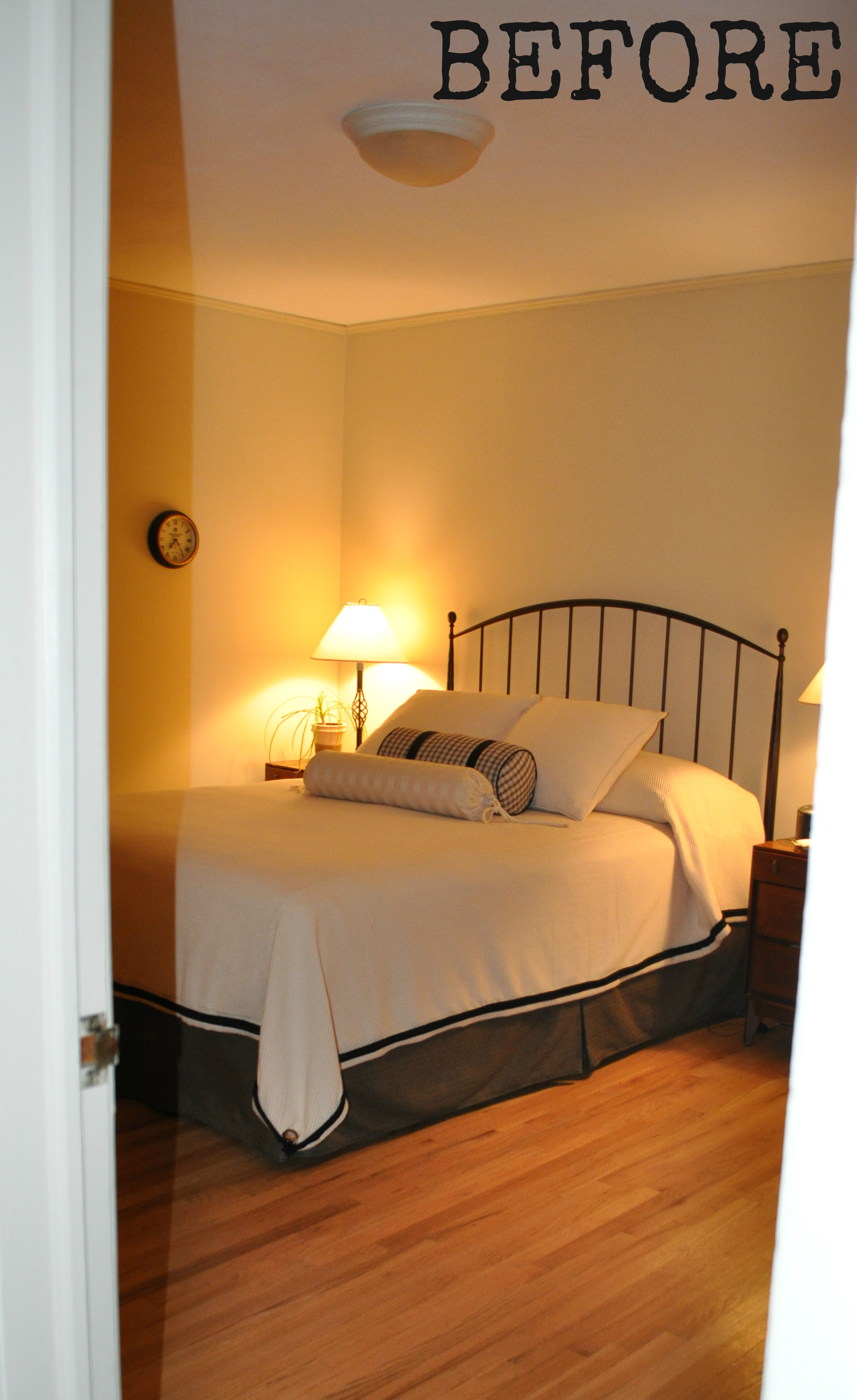
If you feel like you’ve already seen our master bedroom, you’re right. But you see, I realized when I was writing about all the Urban Outfitters stuff in our house that even though I wrote a lot of posts about our master bedroom (8 in total!), I never gave a proper piece-by-piece room tour with resource listings. (Bad blogger!) So, here it is.

master-bedroom-401

Headboard – found in the garbage room of my first apartment about 20 years ago!

White sheets and white pillow casesLands’ End

Duvet cover – Lands’ End (No longer available. Similar available…well,nowhere!! Read all about my hunt for it here.)

Bed skirt – JC Penney (No longer available)

Shams – Urban Outfitters (No longer available. Similar here.)

Chevron pillow – Lands’ End (No longer available. Similar here.)

Linen PillowAtsuyo et Akiko (I’ve now moved it to my living room where it sits in the pink chair.)

master-bedroom-656

 RugUrban Outfitters

master-bedroom-446

Nightstands – Pottery Barn (No longer available. Similar here.)

Lamps on Nightstands – Martha Stewart  from way back – before the Macy’s & Home Depot lines – when she carried stuff like this on her website. (Similar here.)
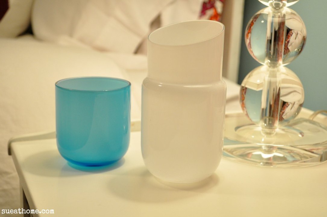
master-bedroom-671

Pill-shaped carafe and glassJonathan Adler

master-bedroom-426

Printed curtains – Urban Outfitters  (No longer available. Similar here.) Find out how I magically lengthened them here.

Black curtain rodsIkea

White curtains – Ikea (No longer available. Similar here.)

Hidden curtain rodHome Depot (A genius solution when you want two curtains. Check out the price!)

master-bedroom-089

Vintage dresser – Craigslist

FramesPottery Barn

master-bedroom-081

Lucite tray – Home Goods (similar here)

Square Bowl – gift so I don’t have a resource (similar here)

Footed bowl – I had this for so long, I can’t remember where I got it! (similar here)

master-bedroom-001

DresserIkea

For Like Ever posterSuper-Rural

Poster frameTarget

master-bedroom-018

Frame with necklacesPottery Barn (I spray painted it black)

Wrapping paper in frame – Old Navy (no longer available)

Black lacquered boxContainer Store

Red metallic pigDaytrip Jr.

It’s still a work in progress (I mean, why would you ever want to STOP decorating?) but it’s come a long way from the bland creamy cream room it once was, huh?

master before

For more posts about our master bedroom, check out these links:

Master Bedroom Inspiration: Olatz Schnabel

The Hunt for Master Bedroom Bedding

DIY: Lengthening our Master Bedroom Curtains

I Will Love This Poster For Like Ever

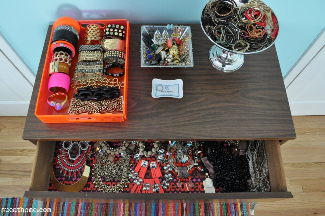
Jewelry Storage: A Work in Progress

Jewelry Storage: Phase 2

DIY: Quick and Easy Jewelry Display

 What’s Wrong With My Bedroom

XO

Sue at Home

Decor, Shopping

An Architectural Gem: Urban Outfitters in Westfield

I live in an awesome town. I pinch myself quite often that I get to raise my kids here. In addition to the nice people, great schools and decent proximity to NYC, one of my favorite things about Westfield is the downtown shopping area. It’s filled with great stores ranging from Mom & Pop places like Brummer’s Chocolates (since 1904!) and Bovella’s Pastry Shoppe (they recently made Bruce Springsteen’s life size guitar-shaped birthday cake) to chains like Williams-Sonoma, Gap Kids, and Clare’s (obvs my girls’ favorite mecca of fine accessories!). Our town even won a Great American Main Street Award – the only town in New Jersey to have that honor.

Until recently, our own little flatiron-esque building was left unoccupied after a bank closed it’s doors over 4 years ago. It’s a beautiful building in the center of the shopping district and it really was a crime to have it sitting vacant for so long. But, good news! A week before Christmas, a new Urban Outfitters opened in that spot and I went to check it out.

Isn’t the building stunning?

urban-outfitters-038

I was thrilled to see that the architect, Dennis Flynn (according to the Westfield Patch) maintained the original look of the bank, including the pillars and tall windows with security grates on them.

urban-outfitters-045

urban-outfitters-051

Inside, there’s more of the original bank: Industrial beams mixed with detailed dentil molding and a spectacular ceiling medallion under a skylight.

urban-outfitters-62

urban-outfitters-128

urban-outfitters-118

They put some drywall in but there is also a lot of exposed brick and details of the original structure. (I wonder if the clock was from the bank.)

urban-outfitters-079

I read in The Alternative Press that the builders had to petition to have some of the windows lowered.

urban-outfitters-125

A mix of materials.

urban-outfitters-082

The thick, dark stairs are a great compliment to the lightness of the moldings.

urban-outfitters-066

I loved the wood paneled room with a marble fireplace in the back, which houses a shoe area. Industrial pipes were added for shelving but the rest of the room is original. The Alternative Press referred to it as the President’s Room and I can just picture an old-school looking bank president presiding at a big oak desk in front of the fireplace. (I’m imagining a comb-0ver, aren’t you?)

urban-outfitters-074

I was totally inspired by this cool display in the president’s room. These are the things that make my gears turn and have me wishing that I had a carpenter as a BFF.

urban-outfitters-076

The checkout counter is simple and highlighted with industrial pendants. (That small door to the left leads to the president’s room.)

urban-outfitters-078

urban-outfitters-091

I loved this magnet thing outside of the fitting room on the top balcony where the menswear is carried. (I’m calling it a “thing” because I don’t know what else to call it. Tool-that-tells-the-salespeople-how-many-items-you-brought-into-the-fitting-room? It’s certainly cooler than a plastic sign with a big 5 on it, right?)

urban-outfitters-086

Our favorite feature of all was the original bank vault (which dates back to 1922). You can see it in the basement at the bottom of the stairs.

urban-outfitters-057

Sale items are kept in the bank vault.

urban-outfitters-098

A great view of the ceiling detail. And a cute kid.

urban-outfitters-133

As for what’s carried at the store, it’s a classic Urban Outfitters with lots of clothes and accessories for men and women plus some gift items. (They even have classic records for sale!) I always find myself wishing that UO stores carried the home items that are on their website. As you know, I have lots of UO home stuff and I think it’s fun, colorful, and best of all, cheap! For some Urban Outfitters home items in my house, check out these links: UO dining room curtains, UO master bedroom curtains, UO master bedroom rug.

Happy shopping!

urban-outfitters-149

XO

Sue at Home

Decor, Travel

Revel in Atlantic City

As we reach the end of the year, I’m trying to catch up on “lost posts” – ya know, those things that I took pictures of because I wanted to share them with you and then I never got around to it. So, with that, here are some pics of the Revel resort in Atlantic City that we visited in August. (August! I know. Sorry!)

revel-161

The wall behind the check-in desk has a digitized camo pattern.

revel-159

One of the restaurants features a living wall.

revel-241

The look of the hotel is overwhelming modern. Quite often, it was a little too modern for my taste but still very cool for a hotel.

revel-121

revel-220

Even the foosball table in the gameroom is ultra-slick.

revel-232

Even with all the slickness, there were some great design ideas to be had. Some of the lounges that were at the bottom of the elevator banks had a wall with wood blocks in different tones. I think it was a really interesting treatment and it’s a great way to warm up a modern space. (It reminded me of this room from an old episode of The Antonio Project on HGTV.)

revel-138

revel-129

Oh…and hello James Nares print! I love that little beauty hiding in the corner. He’s one of my favorite artists. If you’re unfamiliar with his work, check out this post from Habitually Chic. (The best picture is the last one that shows how he makes his paintings. It’s very Tom-Cruise-in-Mission-Impossible!)

revel-151

I loved all of the bookshelves with painted backs. There were only a few coffee table books on the lower shelves but mostly there were just toys and objects.

painted-shelf

Another totally inspiring idea came from this display that hangs in a multi-story atrium.

revel-219

I tried to zoom in really close to see how it was done and it looks like you could make your own with fishing wire and stiff gold paper or sheet metal.  Stay tuned for a little DIY action when I figure out where I want to put that in the house.

revel-210

The outdoor areas of the resort are really interesting. The buildings are so slick and modern but there was lots of greenery. We were loving these huuuuuge rocking chairs.

revel-172

The architecture in the hotel was beautiful. I loved all the curved glass walls. But you can’t help but look around and say cha-ching cha-ching!

revel-182

We were in Atlantic City because Pablo had gotten tickets to take me to see Duran Duran for my 40th but unfortunately that didn’t work out very well. BOOOOOOOOO!

revel-duran

But luckily the hotel was beautiful and we had a great time with great friends despite the cancelled concert. For more info about the hotel, check out Revel’s website. There are lots of great deals so sign up for email alerts if you’d like to visit. I had never been to AC before but from what I hear, this hotel is a huge departure from the old AC. I found it to be as beautiful and grand as a Vegas resort.

Now, I just need to find out when Duran Duran is touring again….

XO

Sue at Home

crafts, Decor

Epic Pumpkin Fail

When I started this blog, I promised to share my successes and my failures. And while I’ve had some toot-my-own-horn  successes lately (dying a slipcover, creating an easy jewelry storage solution, and cooking up a yummy seafood paella), I need to tell you about the pumpkin catastrophe that recently occurred in my house. You’ll remember that I bought some smallish pumpkins and coated them in matte black spray paint. 

Now, I have seen TONS of bloggers write about painting pumpkins and I have never seen any of them warn that this will kill the pumpkins! I painted them on October 1st and you can imagine my surprise when Sophia said, “Mommy. The pumpkin is opening up.” on October 12th. When I came to investigate, I found this:

After we got over the shock, me and the girls took turns plucking the stems off of the rotting pumpkins. They fell right off.

They were so rotten in some spots that they were caving in.

Before you say “maybe they were just bad pumpkins”, I’ll tell you that I bought three other pumpkins from the same place on the same day and those are fine. Surprise, surprise! They have no spray paint on them!

I bought some new ones and I’m thinking of attempting a little gold craft paint on them. I think the key might be to not cover the whole thing. I guess I must have suffocated them! Sorry pumpkins.

 I’m attempting a craft this afternoon with the girls. Hopefully this one will work out a little better. Have you had any craft fails lately? Please tell me and make me feel better!!

XO

Sue at Home

Decor, Home, Pin of the Week

Pin of the Week: Displaying Personal Pictures

I’ve always thought that the idea of limiting personal pictures in your home is so weird. (I don’t understand why this is an issue but check out this Apartment Therapy post about the differing opinions.) I mean, it’s my damn house and if I want to wallpaper it with pictures of my kids so it doesn’t look like a damn model home (gag!) then so be it! (Wow, I just got really fiesty there. Sorry.)  For me, displaying personal photos in my home supports just about every point of my Design Manifesto.

Anyway, I LOOOOOOVE this pic that I spotted this week on Dilly Dallas. Dallas Shaw posted it from her trip to Palihouse in West Hollywood. I just love the idea of filling a massive frame with a ton of pictures. I’m not talking about your standard run-of-the-mill collage frame that’ll hold maybe 9 pics, I’m talking about hundreds. And that’s a lot of pictures here, people. Let’s take a peek:

I found this other pic on the Palihouse site. I think we can confirm from this that it holds at least 308 pictures. (That’d be 14 columns times 22 rows – I’d like to thank a high school math teacher for my vast math knowledge but it was really just Google Calculator.)

palihouse

The point is, no matter how you add personal pics to your home, it’ll be a quick easy way to make it yours. Let’s take a peek at some other great personal photo display ideas.

I think this inspiration board is great and this could be a perfect way to have an ever evolving wall of pictures. P.S. Bonus points for the SICK suzani chairs.

Or you can just go large scale, like this from Nectar and Light:

More large scale prints from Sabbe Spot:

Better wallpaper Co makes oversized prints.

Even bigger: Photo wallpaper via Apartment Therapy

More wallpaper here via Apartment Therapy.

A wall-filling collage via Melange photography

melange

I just die over these massive headshots from Hillary Thomas Designs. (You’ve heard her name here before. That’s the same Hillary Thomas of the genius malachite finials and malachite bowl in the last Pin of the Week post.)

You will not believe how easily – and cheaply – Mandy at Sugar Bee Crafts DIY’d this huge picture of her girls. Click here for Mandy’s tutorial:

How about this dark teal wall (much like my living room) with big prints just pinned up with nails. I love the low-commitment of that! via Remodelista

indigo-blue-wall-white-couch

This is such a cute room (mint stripes!) and I love the simplicity of the repetitive black and whites in matching frames. It’s kinda perfect. Via Daily Dream Decor.

A DIY collage can be achieved by attaching a bunch of frames to a base. Oh…and let’s take a moment to marvel at the CUTE model. It’s my Sophia modeling (that’s right! modeling!) in the pages of Ladies’ Home Journal!

soph modeling in LHJ

I love these pics stuck up on a wall above a mantel. via Apartment Therapy from Domino

Some more oversized pics, this time in a grid. Via Tara Whitney.

Let’s take another look at the Palihouse frame. I love it and I really want to do it. BUT it’s so big and probably expensive (for the frame) and hard to change the photos and they’re all horizontal. I’m dying to do this but I need to modify it somehow. But how?

This seems a little less daunting. Via More Design Please.

And of course, there’s always the gallery wall option. I particularly like this idea of black and white pics in all red frames. Those little gallery lights make it perfect. Via ELLE Decor.

elle decor red frames

Personally, I like to use simple candid pictures. One of my favorite pictures in my house is this one on our gallery wall. I call it Thelma and Louise. It’s a canvas print but I don’t really recommend them. I think they’re very pale compared to the original.

I don’t know about you but I’m totally inspired right now. I might go build a frame that’s taller than me or maybe I’ll buy 200 of those cheap Ikea frames and make a wall collage. Either way, I’m motivated and you know what that means…you’ll be seeing the results soon!

Tell me…how do you display personal pictures in your home? A gallery wall? A grid? Oversized prints? Just a few prints in the hall or staircase? Or are they covering your house? Tell me in the comments…

XO

Sue at Home

Decor, Home, My house

Let’s Talk About Those Copper Spheres – Part II

As you’ll recall from Part 1 of this story, we bought two big copper balls for $10 a piece at the Design Within Reach Annex in Secaucus. They were tagged as being Roberto Menghi’s Globo di Luce pendant but I’m quite sure that the plasticy burnt-out and slightly-scratched balls that we have aren’t the blown-glass originals. (A floor sample perhaps?) But even though they’re just the shell of a Globo di Luce, they’re kind of cool. Yet the question remains–what to do with them?

The original inspiration of using them as an objet was this pic from Apartment Therapy that I pinned as an idea for Pablo’s man cave.

In our house, his “cave” is actually a light filled den with a fireplace…and wood paneling. His one request: The wood paneling stays. So, my plan is to go for a swanky mid-century feel like the picture above. I love how the surveillance mirrors are used as decoration. I figured the balls could sort of do the same thing. But the problem: our rooms are small. And my balls are large. (Go ahead. Let the pre-teen in you have a giggle.) You see, having a 16 inch diameter pair of balls sticking out of the wall looks like Angie from Survivor’s boobs. I stuck one on a nail from a picture of my gallery wall just so you can see what they look like hung – even though I wouldn’t put them in this space. See what I mean?

It can also be hung by the big hole so the smaller opening is on the outside. Let’s try that. Nope…still looks like a boob. But now it’s a boob with a nipple.

Let’s try something else. Since the den has recessed lighting, I figured we could hang them from the ceiling  just as a decorative object. But the place to do that would be over the table in the den and we thought that would look pretty cool. Until we realized it looked like this from the kitchen. (See below.) Combined with my beloved Hicks pendant in the kitchen, the view became Sphere City.  (For the purposes of this experiment, the role of “Price Is Right Girl” will be played by my hubs. BTW – Did you hear they finally hired a guy to display the washing machines and boats on Price is Right? I think Pablo could have kicked his ass if he had auditioned.)

And don’t forget, I’ve got CB2’s Firefly light in the dining room. (I’ve obviously got an Orb-session. Wonder what Freud would say about that?)

We had them on either side of our entertainment center for a little while but they weren’t great there either. But looking at it now with my pink chair, I’m not hating it. (Though I do hate how it seems to bring more attention to the monstrous TV. (I painted the walls a dark color because I wanted the TV to recede, not stand out.) What do you think?

I figure I can rig them up somehow to hang them right on a wall as long as I find the right space. Maybe in the kitchen?
The living room? The foyer? The bedroom? But would it be too boob-like??

The jury is still out on my copper balls but hopefully I’ll find somewhere to hang them soon. Got some ideas? Please tell me in the comments!

XO

Sue at Home

Decor, Home, My house

Let’s Talk About Those Copper Spheres

Back when I told you the sad story about my lack of a linen closet, I let you in on the secret that makes my little house work: my walk-up attic. And when I showed you this picture, I knew there would be a question or two about those big copper balls that live in the attic right now. And I was right.

The thing is – they only live in the attic because I don’t know what to do with them. Yet. Here’s how they came to be ours.

It was quite awhile ago that I started spotting these amazing copper pendants throughout the blogosphere. I remember seeing this image and it was a truly gasp inducing sight.

A little research taught me that the designer of the pendants was Tom Dixon but at this price, they were never going to be mine.

So, when Pablo and I used a summer Friday last year to spend the day shopping for the house sans-kids (which is the ONLY way to shop P.S.), we were thrilled to stumble upon these weird slightly-burnt plastic copper-looking balls at the Design Within Reach Outlet in Secaucus. I immediately loved them for their Tom Dixon-ness. Pablo, who doesn’t know his Tom Dixon from his Thomas O’Brien, just thought they looked cool.  (He’s cute when he gets excited about design stuff, isn’t he?) Oh, and did I mention that we paid $10 a piece for them?

A little research showed us that our Design Within Reach balls were actually the originals, designed when Tom Dixon was just 9 years old. According to the DWR site, the Globo di Luce Pendant was designed by Roberto Menghi in 1968 and it’s made of hand-blown glass. So, in fact, lots of the “Tom Dixon” copper pendant pics I had been dying over could have actually been Menghi’s Globo di Luce. They’re so similar, it’s nearly impossible to tell from a picture.

Don’t get me wrong. I’m not knocking Tom Dixon. He’s an amazing designer and artist and I would give my left arm to have a bunch of his Beat Lights hanging above my dining table. Aren’t the shiny gold interiors divine? (Photo via Y Lighting)

tom dixon beat

I just think the design world shouldn’t get their panties in a bunch about Tom Dixon’s copper pendants when they are clearly a tad derivative. Anyway, let’s get back to my balls. (Insert laugh like a pre-teen boy here.) If you’re the kind of person that solves the mystery in the first act (I’m talking to you, Mom!), then you might have figured out where this is going. Did you pick up the clues? You see, I mentioned that the $10 things we bought were plastic-y and kind of burnt looking, yet the DWR site clearly states that the Globo di Luce is made of handblown glass. So, we assume that ours were some kind of store display item (I can’t imagine how fragile the actual blown glass globe is!) that was never supposed to have a lamp in it. That would explain why they were kind of charred and why they were $10 instead of $1355 like they were originally tagged for. (Did someone put a bulb in them when they weren’t supposed to?) But we figured we could hang them somewhere and just use them as an objet. (Yes, I just used the French word for object. I kinda love  it and I’m not at all embarassed using it. OK. Maybe a little embarassed.) And we tried a bunch of different places around the house but they weren’t quite right anyway. So a year later, my balls live in the attic.

Tomorrow let’s talk about a few of the ideas we’ve had for hanging them around the house.  I think you’ll agree that several ideas don’t work  because they either look like cajones or “boops”. FYI: that’s Lily’s word for boobs. How cute is that?

More balls tomorrow!

(UPDATE: Click here for the link to the second part of the story. And click here to see where we ended up using them.)

XO

Sue at Home

crafts, Decor, Home, My house

DIY: Quick and Easy Jewelry Display

I recently completed Phase 2 of organizing my jewelry (which you read about here yesterday) and I managed to find a home for just about everything–except for a handful of long necklaces.  I spun around my room scanning for a place to put them and this frame that I had sitting on our dresser jumped out at me. You see, I had put it there recently because I felt like I needed something in front of my For Like Ever poster (read more about that here) to break up the vastness of it. It’s not fancy–I just cut a piece of old wrapping paper and stuck it in the frame. Thankfully, it worked and it was all starting to look a little more like a pretty vignette rather than a massive poster propped against a wall.  Here’s what it looked like with the addition of the frame:

You’ll also notice another new little friend. That’s the teeny tiny piggy bank I bought at Daytrip Jr during our trip to Maine. Isn’t he cute?

You might recognize that wrapping paper that I used as the drawer liner from Phase 1 of The Great Jewelry Organization Project (read more about that here.) See it hidden under all my baubles?

Anyway, back to the frame.  I noticed that it was kind of long–like the necklaces–so I figured I could make something out of it. I grabbed some pretty rose-goldish nails that I had bought for a forthcoming String Art project and got to work. FYI: The frame I used was the Wood Gallery 4×6 triple frame from Pottery Barn. At 18″ high and only 11″ wide,  it’s the perfect size.  (Yes, my hammer is pink. You got a problem with that?)

I removed everything from the frame (I would not recommend trying this with the glass still in there!) and drew a straight-ish line across the top in pencil. Then I measured 1 inch spaces across the top so the nails would be somewhat uniform. As I nailed, I decided to put some a little off the line because I figured I might split the wood if I stayed on the same line. Did it come out pretty and perfect? Nope! But as you’ll see below, you can’t tell that the nails are a little lot crooked when it’s all put together.) I was very careful to make sure they were nailed in far enough to hold a necklace but shallow enough so they weren’t coming through the other side.

When I was done, I put the frame back together and started hanging the necklaces.

I’m glad I put the nails an inch apart instead of closer because I needed a little space between each necklace.

I think the little piggy likes it too!

XO

Sue at Home

Have you done any fun DIY projects recently? Let me know in the comments below!

Before and After, Decor, Home, My house

I Have a Hot Pink Chair!

I have been wanting a hot pink couch or chair for like ever. Remember when I showed you all those dreamy pink pics and told you I was thinking about dying an old slipcover I wasn’t using? Well, I did it!

Here’s the best part: this renovation cost less than $10. That’s right! Ten buckaroos! How, you ask? Well, I already had the chair and a pale pink slipcover. The chair is from PB Teen but unfortunately for you, they don’t make it anymore which I think is a crime to humanity because it’s comfortable, cute and cheap and for quite a while, they were offering slipcovers in different fabrics and patterns. When I got the chair, I picked up three velvet covers: white, bubblegum pink, and pale blue. (What? I figured the chair could be used in other rooms so I wanted to have options! That’s normal to buy three, right? ) Of course, I’ve only ever used the white one.

I decided to use RIT dye in fuschia. The directions called for 1 package of dye for every pound of fabric so I went for three since my slipcover was nearly 3 pounds. I couldn’t find a bucket big enough so grabbed this color-coordinated (!!) storage bin at Home Depot and got to work. First step, fill the bucket with 9 gallons of hot water:

Then I mixed 3 packages of dry dye with 6 cups of hot water and stirred it very well until all the dye dissolved. (Note: it did not stain my measuring cup. Bonus!)

Then I added the mix to the dye bath and stirred. (Please note that I did all this on my deck and I was wearing rubber gloves. They are not kidding about the staining possibilities so take all the warnings seriously! If you don’t believe me, come and ask the few pink dots on my kitchen countertop.)

Before adding the slipcover, I pre-wet the fabric in hot water so the color would penetrate the fabric evenly. (Having the lid to the storage bin was helpful for this step because it gave me something to carry the wet fabric on.)

And then in it went! Next up, I stirred and stirred and stirred for about 25 minutes. If you’ve never pushed a sopping wet pile of velvet around with a paint stick before, I can tell you that you will use muscles you didn’t even know you had. Ouch!

Next up, I rinsed it in the utility sink (which is now pink) in my laundry room. First in warm water, then cooler until it ran clear. This was another special type of muscle torture that I wouldn’t wish on my worst enemy! Then the scariest part of all – into my beautiful new-ish washer it went! (Don’t worry. The washer came out unscathed.)

I gave it an air-only dry in the dryer and ta-dah! Here is the finished product!

My wise husband (who so kindly signed off on this project before I did it and then called it “awesome” because he knew how excited I was about it) was the one to point out the patterned pillow was a little too much. So, I stole the Je T’aime pillow (similar here) that used to live on our bed. Much better, don’t you think?

I love how the pink looks against the dark teal walls.

The color came out so even. I’m actually mad at myself for being so scared to do this for so long!

I love the way it pops in the room.

Maybe now guests will sit in the chair. They were always kind of scared of it when it was white.

Oh happy day! I have a hot pink chair!

XO

Sue at Home

Disclaimer: Please do not dye anything hot pink in your home without running it by your significant other. I’ve learned that though there are many people who like the looks of hot pink furniture, there are not a lot of people brave enough to go for it. And there are many, many more people who are terrified of it. Thankfully, my husband is comfortable enough in his sexuality to not be so concerned about a little pink in his house. (Though maybe he should because I could possibly love this chair more than I love him. Kidding, honey!)

Decor, Food, Travel

A Visit to Hidden Pond

When we recently went to Maine and stayed at Tides Beach Club, we had to make a visit to Hidden Pond, Tides sister hotel located deep in the woods. The resort is a series of free standing bungalows – some one-bedrooms for vacationing couples and some bigger cottages for families. We had read a lot about Earth, Hidden Pond’s farm to table restaurant so we decided to give it a try. The decor was so spectacular that we were smitten with the place before we ever took a bite of the delicious food. Check out this branch that was suspended from the ceiling and wrapped in twinkle lights.

The shelves above the bar were simple but stunning. And I’m guessing those are Tom Dixon pendants (or  something similar).

Two of the walls were lined with slices of logs. (The treatment that the Novogratz’s just gave to Tony Hawk’s fireplace reminded me of the decor at Earth. Check it out here.) We also loved the industrial light fixture of hanging bulbs. But the best was the beautiful chesterfield sofa that sat in front of a roaring fire.

We went back to Hidden Pond to hang out at the adults-only pool the next day. It was located in front of The Tree Spa. We didn’t get a chance to indulge in any treatments but the spa was named to Conde Nast Traveler’s Hot List so I’d guess it’s pretty good.

If you ever wanted to know what it’s like to get a massage in a treehouse, then The Tree Spa is your place.

Near the pool is one of Hidden Pond’s firepits. I was upset that we never visited at night (they bring you a basket of s’mores fixins!) but that would have meant that would have missed the amazing dessert we shared at Earth: Banana and Peanut Butter ice cream with salted caramel.  It was one of the best desserts I’ve ever had!

The outdoor bar by the pool was so cute and it has so many great ideas for modern rustic decor. Check out that woody cocktail table.

These baskets were cut in half and attached to wall the hold citrus.

I loved the huge mason jar water jug and the bark-edged bar.

I love this idea (mason jar + sand + candle) and I’ll totally do this for my beach house. (Too bad I don’t have a beach house.)

This little chalkboard cow offered a healthy treat. And then at 11:30, the bartender wiped it off and replaced those words with “Margarita” and “Bloody Mary”! I had to have a bloody, of course. (Check yesterday’s post of the picture of that beauty.)

We loved the super rustic style of Hidden Pond and I think we need to go back one day for the s’mores!

XO

Sue at Home

Check out my other posts about our trip to Maine.

Three Days in Kennebunkport, Maine

Decor Ideas from Tides Beach Club in Maine

How to Create a Tides Beach Club Room at Home